2020 Label Design Trends: Going For Bold
For the last several years, across many industries, label design has been trending towards minimalism, neutral colors, and natural looks. We’ve talked a lot about the incredible impact and proliferation of minimalistic label design
elsewhere. While for many brands those low-key styles are still appropriate, in 2020 you can expect to see lots of companies incorporating some bolder design elements, from typographic features to geometric shapes. Here are 5 label design trends that will be on the rise in the coming year.
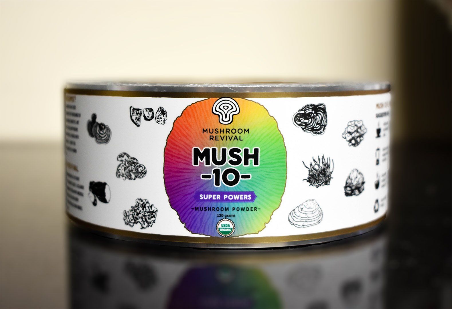
Mushroom Revival's Mush-10- Label incorporates a polychromatic gradient that contrasts incredibly with the otherwise neutrally colored label
GRADIENTS
The use of gradients in all kinds of graphic design has been growing in popularity for a while, but you can expect to see gradients appear in new and creative ways in label design. One of the best things about gradients is their versatility. Want to make a particular aspect of your design pop? Or perhaps your goal is to captivate customers with something more forceful? Gradients are an excellent means to demonstrate your creativity and brand identity.
Some of our friends in the supplement industry are already using gradients on informative graphics as a creative way to draw attention to important product details. In the craft beer industry, many brands are using brightly colored background gradients that are certain to attract buyers in that competitive and creative industry. However you decide to use gradients, they are an effective element to have in your design tool belt.
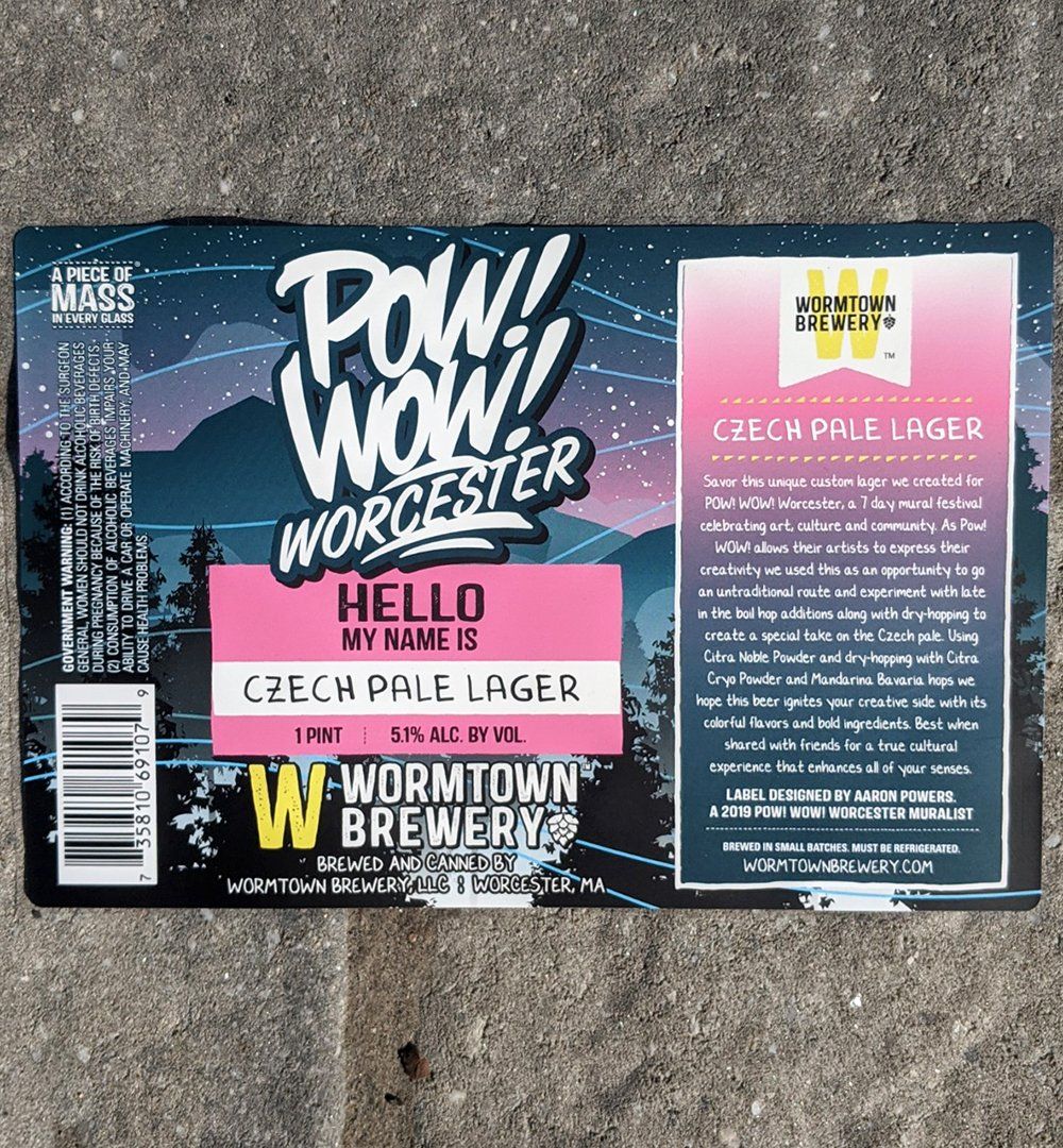
We love how Wormtown's Pow Wow Lager has a totally retro vibe and color scheme
RETRO
There’s nothing like a little nostalgia to give buyers a nudge toward your product. The tendency of beings drawn toward products that evoke feelings of earlier times is not new, but this year expect to find retro and vintage label design that incorporates more of the bold colors and patterns of the 80s and 90s. Much of this trend is being driven by Millennials who grew up in these decades and who are now coming of age, spending power-wise. According to Lexington Law, the “full impact of Millennial purchasing power and brand preferences will come into full effect in 2020 when their purchasing power is projected to reach $1.4 trillion.”
Be on the lookout for retro label design on products from cosmetics to beverages. Expect to see products with pixelated typography reminiscent of early video game systems and neon colors. With so many ways to go retro, there’s a little something for every type of brand with this trend.
Be on the lookout for retro label design on products from cosmetics to beverages. Expect to see products with pixelated typography reminiscent of early video game systems and neon colors. With so many ways to go retro, there’s a little something for every type of brand with this trend.
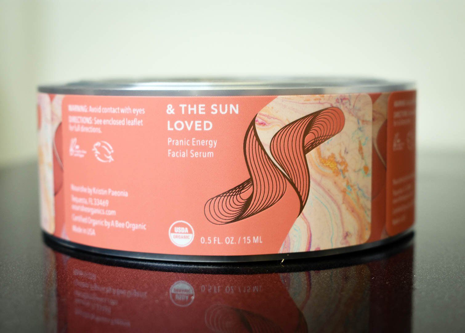
Nourishe Organics uses geometric line patterns and marbleized elements on their gorgeous labels
GEOMETRIC SHAPES
With all the bold design cropping up, geometric shapes are a superb way to combine simplicity with impact. From a few lines to emphasize part of your label design, to a kaleidoscopic pattern as your background, much can be accomplished with a just a few simple shapes. So many of our partners use geometric design elements to great effect.
Geometric shapes can be used just about any brand in just about any way. While many players in the craft brew industry go all out with label backgrounds comprised entirely of brightly colored shapes, you don’t have to use flashy triangles or busy geometric patterns to take advantage of this trend. With the vast possibilities, incorporating more subtle geometric elements can enable you to accomplish exactly the look you want.
Geometric shapes can be used just about any brand in just about any way. While many players in the craft brew industry go all out with label backgrounds comprised entirely of brightly colored shapes, you don’t have to use flashy triangles or busy geometric patterns to take advantage of this trend. With the vast possibilities, incorporating more subtle geometric elements can enable you to accomplish exactly the look you want.
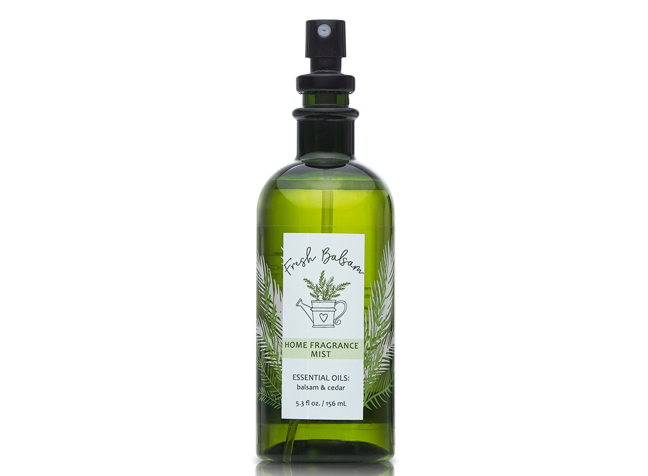
By using a clear label material, AP Fragrance is able to show off their bottles and take make the most of their beautiful art
TRANSPARENCIES
There are diverse ways to incorporate transparent aspects into your label design, and frankly, we love them all. Perhaps it’s with a label itself that is clear so your product shows through. Or maybe playing with the opacity of elements of your art is more your style. We’ve long been proponents of the “no-label-look” that is so popular in the beverage and health and beauty industries, but it’s exciting to see brands getting creative with clear material and transparent aspects on their labels. Any way you go, transparencies can be a clear path to getting noticed.
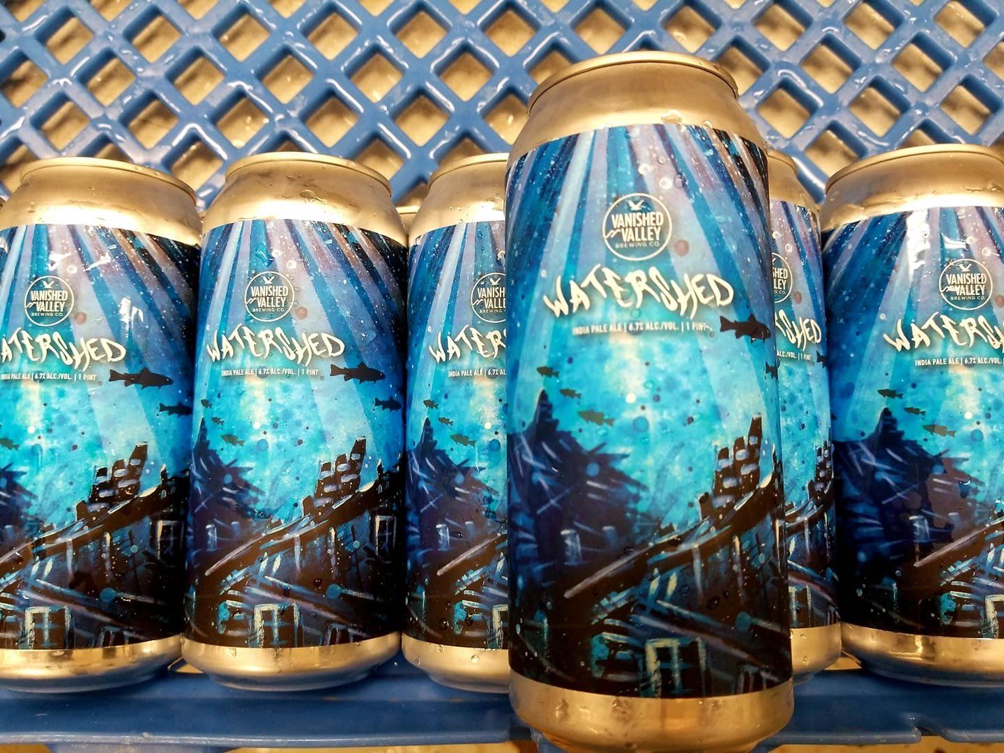
The typography of Vanished Valley's Watershed IPA not only aligns perfectly with the rest of the label design, but it's a work of art itself
BOLD TYPOGRAPHY
Bold design isn’t limited to art. If bright and busy backgrounds aren’t right for your brand, you can still make a statement by using typography that stands out. From a simple sans serif with a heavy stroke to lettering that’s made up entirely of patterns or illustrations, typography can provide an awesome outlet for creativity.
What’s more, with typography you can use gradients, retro elements, geometric shapes, and even transparencies! We love how typography can pull double duty, declaring a brand or product name while also communicating your brand identity and engaging customers visually with your product. If you think your typography doesn’t play an integral role in your design, think again.
You put so much creative thought and energy into the design of your labels; don’t you want a printer who can promise you the quality finished product you deserve?
Request a free sample packet today to see some of these design trends in action!
RECENT POSTS
WHO WE ARE
our solutions
our WORK
RESOURCES
DION LABEL PRINTING
FACILITY/MAILING
539 North Road
Westfield, MA 01085


