5 Label Design Trends We Love
Competition is fierce in retail markets across the board. Today’s consumer has an abundance of choices when they are considering buying just about any product. While making quality goods is essential to your brand’s success, it’s hard to underestimate the power of packaging and label design in nudging a potential customer in the direction of your item over the multitude of others on a retail shelf or e-commerce site. And while label design trends can be transient, there are some that have proven their impact on consumers and are well-worth considering when you want to boost your sales and create customer loyalty. Here are five label design trends that we think are worth taking note of.
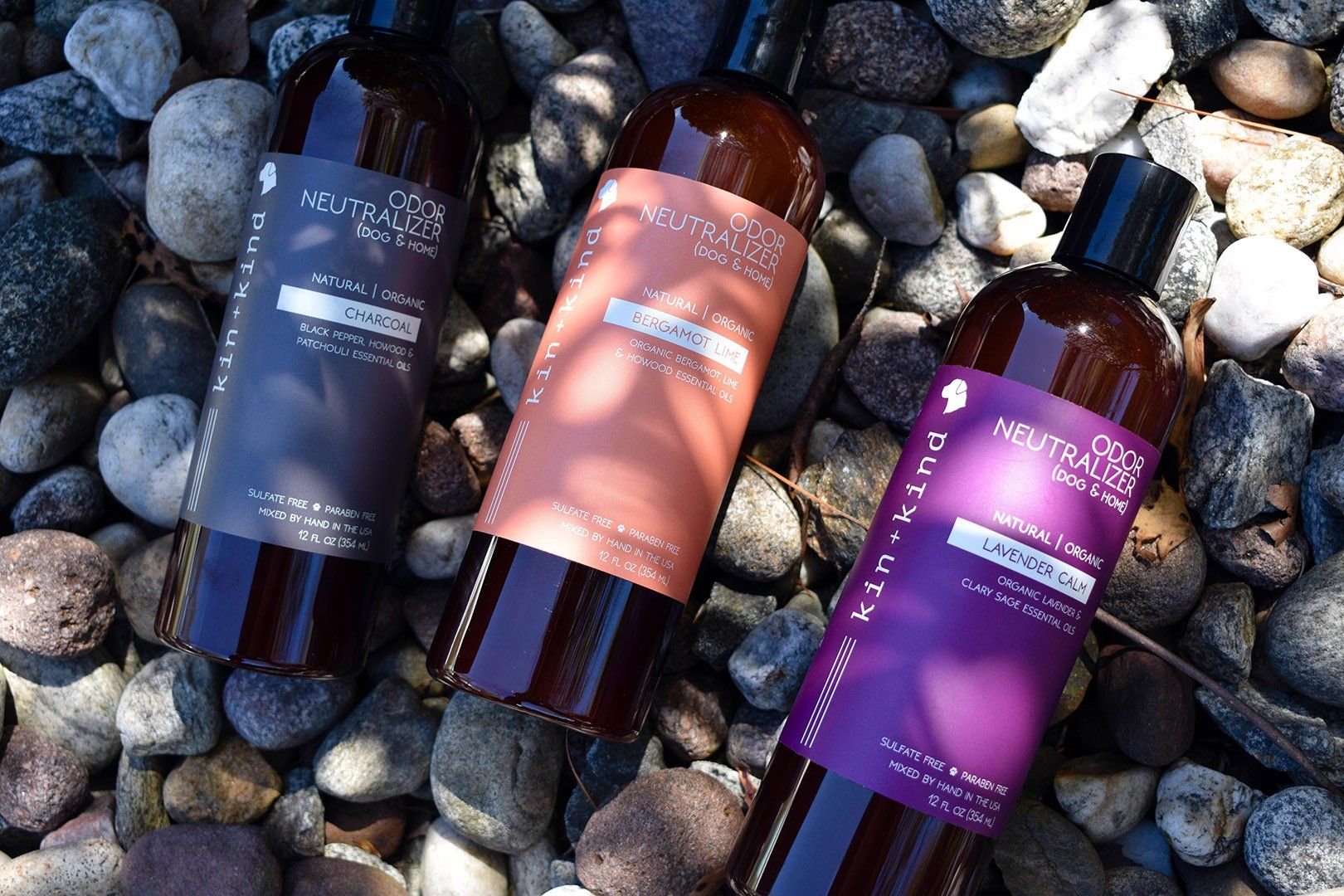
Kin+Kind pet grooming products get minimalistic label design right
1. Minimalism
As we’ve discussed elsewhere, minimalistic design is a branding choice that more and more companies are implementing. The reasons for the proliferation of minimalistic design are many and varied. The ostentatious and often gaudy design trends of previous decades—think the prevalence of neon on products in the 80s!—seem to the modern consumer gimmicky. And while nostalgia can be a way to connect with customers, as we’ll discuss below, no one wants to feel as if they’re being tricked into buying something.
Minimalistic design can communicate so much to your customers: that you use simple ingredients, that your product is of such outstanding quality it requires no adornment, or that your brand is modern and luxurious. Remember that your packaging choices aren’t just a means to drive sales—you want your labels to tell your story. Minimalistic packaging design allows you to communicate that you are a contemporary brand who participates in ideals aligned with the modern zeitgeist. If you want consumers to associate your product with a healthy lifestyle or a luxurious treat, it is essential that your label communicates this. By electing design features that are straightforward and clean rather than crowded and busy, you will take great strides toward imparting your brand message to potential customers. A simple and clean design may be just what you need to differentiate your brand!
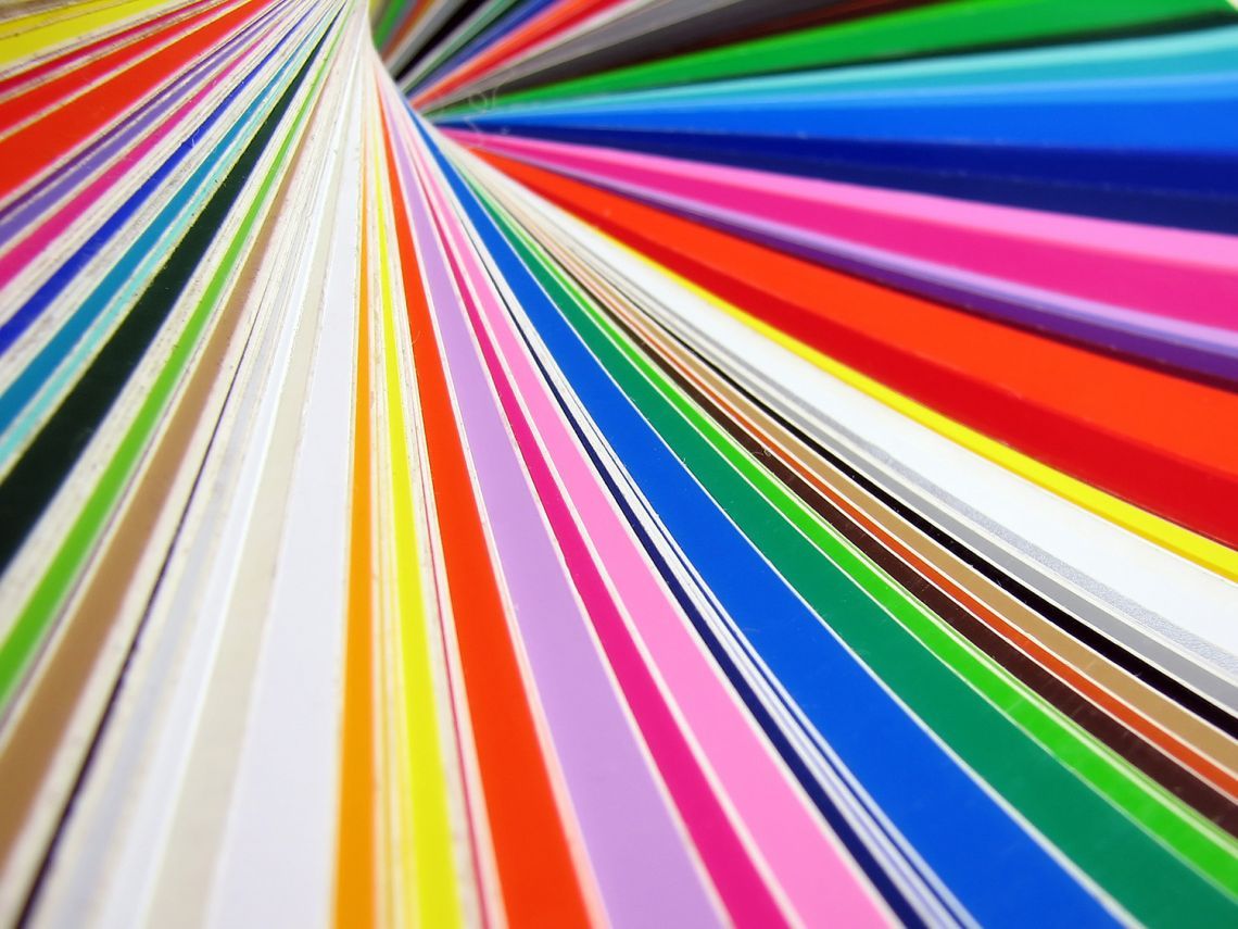
2. Gradients
Gradients are an amazing and functional way to use color that can distinguish your label and product from the pack. Working with gradients offers tons of opportunity to forge unique and arresting imagery. A subtle single-color gradient can create understated texture or vibrant color pairs can give a unique product a special feel. Whether you use a gradient as a background for your entire label design or as a smaller feature to distinguish a particular element of your label, gradients are a superb design component that are becoming increasingly popular among brands. If you’re looking to modernize your label and up the allure of your product, gradients are an easy and impressive way to do so.
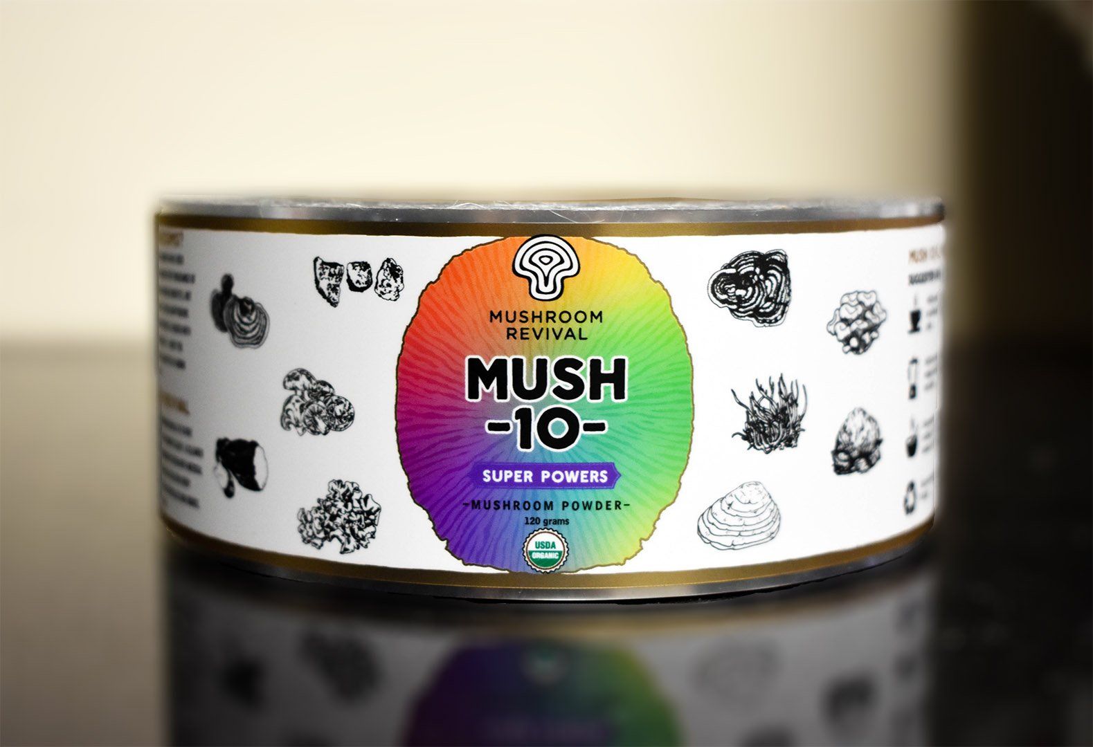
The bright gradient
Mushroom Revival uses as the only color on their Mush -10- Super Power labels is vibrant and on-brand. We love the metallic effects too!
3. Vintage
Another trend we love (and consumers do too!) is vintage or throwback label design. Harkening back to an earlier time period can be an excellent way to establish a connection with customers. Not only that, but vintage style is chic among many people, especially millennials. There are so many ways to go about vintage-style design, from retro typography to art-deco patterns, to imagery that gives the immediate sensation of an earlier time. We all know that selling a product to a customer is ultimately about connection, and for some brands, a label with a nostalgic feel is the perfect fit.
4. Transparent
The “No Label Look” has long been popular in the craft beer and beverage industries, but the last few years have seen this trend transcend industry lines. Using a clear film base for your label material opens some fantastic design doors. If you’re using a container that is attractive on its own, a clear label allows you to present that container in a more forceful way than an opaque label would. Similarly, if your product itself is attractive, such as a richly colored smoothie, a clear label enables you to show it off. Using bold color on a clear label can be an effective means for drawing the eye of potential customers; on the other hand, subtle neutral colors on a transparent film can indicate a more natural and transparent brand identity.
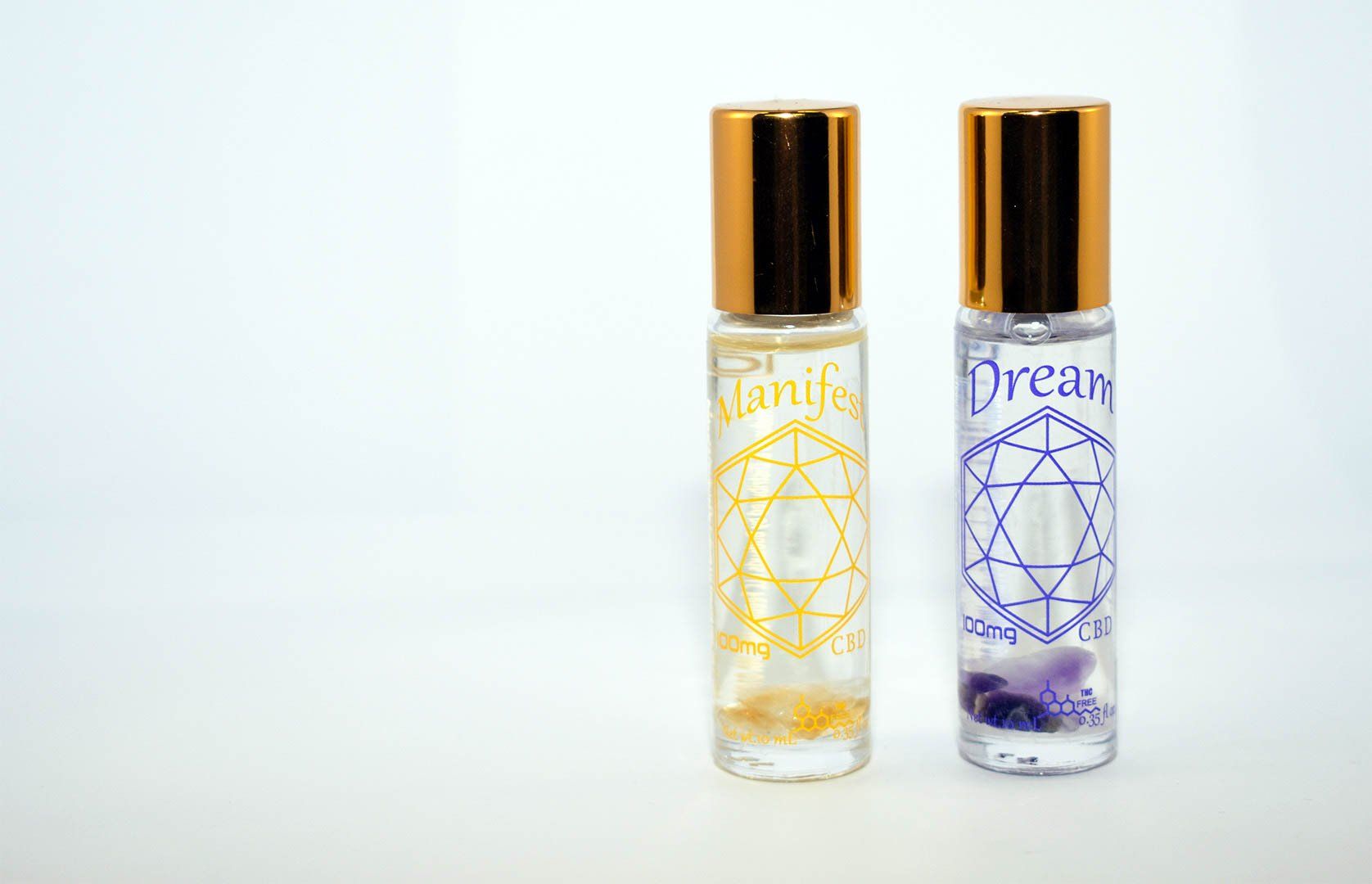
Budsuds CBD Roll-ons use clear labels to "manifest" the nature of their hand-made product—the gems at bottom are an awesome addition!
5. Color
Pantone’s 2019 color of the year is called “Living Coral,” but you don’t have to rush to incorporate that precise color into your packaging design; instead, make sure that your color choices are deliberate and well-suited to your brand identity. If you’re a health brand, it may be a neutral color palette that evokes feelings of cleanness and simplicity. If you’re looking to wow potential customers with a delicious product they’ve never tasted before, bold and bright colors may be for you. Regardless of the actual colors you incorporate in your design, it is essential to maintain a color palette that is aligned with your brand. The impact of color’s influence over buying decisions is well researched, so making an intentional choice in your label’s colors is of paramount importance.
Design trends, while not always worth jumping at, do come around for a reason. If you are a new company looking to make space for yourself in an already crowded industry or an established brand who wants a larger impact from your labels, the Dion team has the tools and skills to create labels you will love. We are experts on color, offer an extensive selection of materials, and have multiple levels of quality control before, during, and after the print process so you can rest assured that whatever design you choose, your labels will be incredible. Request a free sample packet today to see our print work for yourself!
RECENT POSTS