50 Years Young: Dion Label Printing Launches Company Rebrand
Dion Label Printing has rebranded in anticipation of our 50th anniversary approaching in two short years. Rebranding efforts consisted of updating our logo, brand colors, website and all branding materials.
After half a century in business, Dion’s goal was to refresh our look. In an effort to modernize, our brand now reflects a clean and bold appearance that embodies our personality as a detail-oriented company and leader in the printing industry. President John Dion explains, “I would like our customers to view this rebranding as a renewed commitment to them and a herald of further improvements in the ways we conduct business together.”
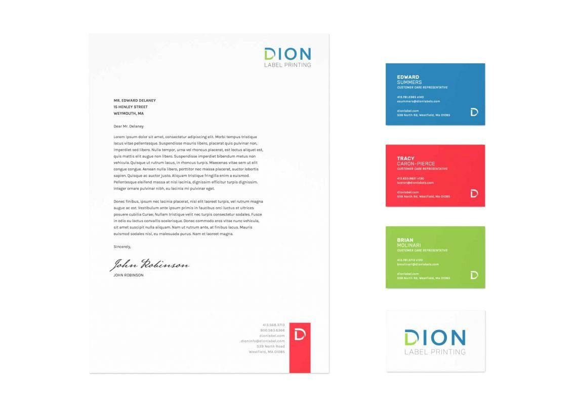
The new logo is pictured above. Notice that the “D” in Dion is separated into two halves, representing both the “D” in Dion but also the “L” for labels which is our primary product offering. A contemporary sans-serif font is used and the overall shape is fit into a condensed rectangular area that will work well with our social media efforts. Blue and green tones reflect trust and dependability which mirror the company values. Pops of red will be incorporated in our website and branding materials that reflect energy and passion.
The Dion Label Printing website has been completely redesigned and now features a clean, easy-to-navigate layout. Primary offerings are easily accessible and high-quality images of our products are highlighted. A customer login section will be added for customers to view open orders and make payments securely. The website is also mobile-responsive based on current technology and devices available on the market.
Though a lot has changed, core items have remained the same including our company name, ownership, management roles, employees and facility location. Our capabilities, quality-driven work ethic and dedicated customer support remain consistent. General manager Randy Duhaime continues in saying, “I am very excited about our rebranding and reaching our 50th anniversary. Quality products, innovation and extraordinary customer support will continue to be the principles we follow to help our customers succeed.”
To aid in our rebranding efforts, Dion Label Printing partnered with a Boston area design and branding firm. The branding firm built and engineered our website, created and developed the logo and brand colors, as well as designs for marketing collateral. The process began with a launch discussion based meeting with key players in the rebranding process, moved into a collaborative design phase and finished with implementation and the final launch.
Marketing manager Ashley Obara comments, “The Dion Label Printing name is associated with quality and progression in both our capabilities and technological offerings. It only makes sense that our own image should reflect these qualities through vibrant colors and a user-friendly, interactive website. We are excited for the refresh and the direction it will take us in the future.”
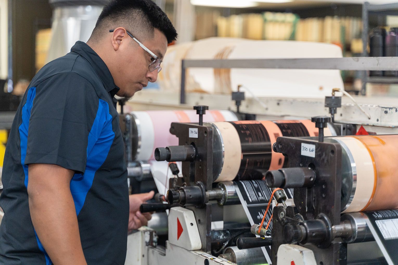
Dion Label Printing strives to elevate our customer’s brand through high-quality printed labels and packaging. With only seconds available to make a first impression, your label needs to make a lasting impact. As a leader in the narrow web printing industry, we continuously endeavor for the highest quality service and product while pushing to innovate. Both digital and flexographic printing capabilities are available, allowing us to provide quantities ranging from the millions down to the hundreds.
RECENT POSTS