The Difference is Clear with a No Label Look
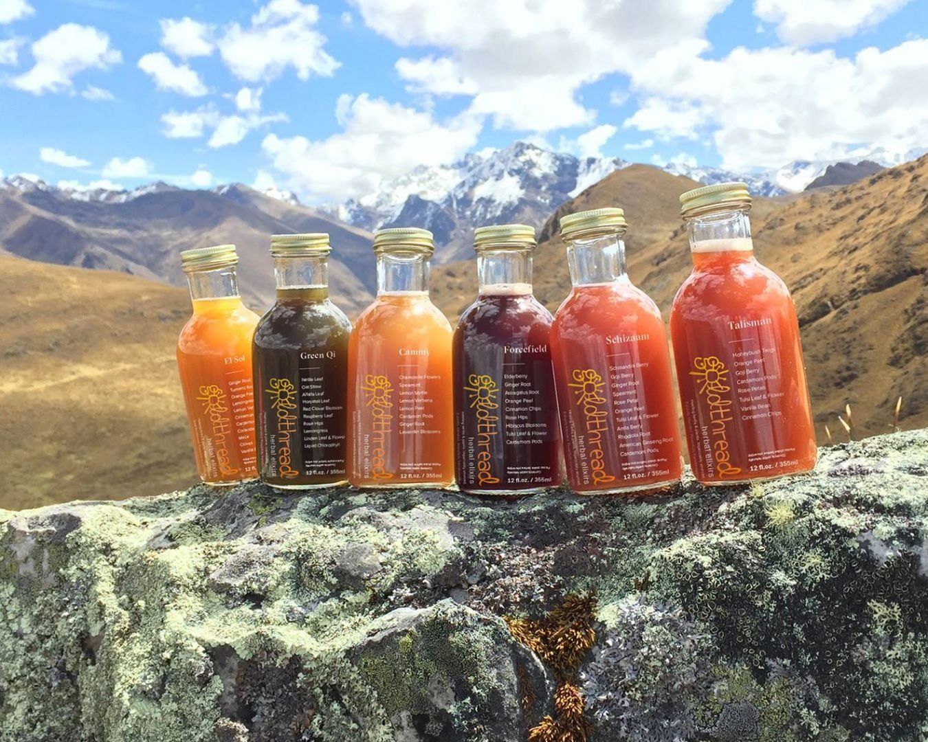
Photo Courtesy of Goldthread
Many companies decorate their labels with vibrant colors with the hopes that it will drive consumer attention, but taking a different approach with your labels can have the same effect. In fact, looking as if there is no label at all is currently trending with designing labels. This type of “no label look” is desirable across the health and beauty industry and is making an appearance in the food and beverage industry.
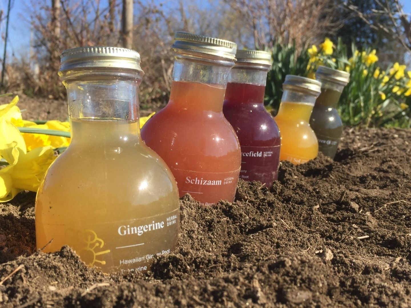
Photo Courtesy of Goldthread
Choosing a material for this look that balances between flexibility and transparency can be a complex process. Luckily, Dion has two materials we suggest using in this application. Pairing this substrate with minimal text and graphics is a sure way to make a perfect clear label. It’s possible to use selective varnishes to achieve a specific feel to your labels, but generally you want to keep the label’s design as straightforward as possible.
Goldthread’s herbal drink label is a great example of a clear label done right! Their ombre yellow-to-orange logo is the only splash of color on an otherwise clear label. Consumer attention is drawn to the display of colorful drink product in the background rather than the label.
Our aim is to make it easier to bring the advantages of the no-label look to your brand. If you’d like to find out which materials are right for your no-label look, please
contact us!
RECENT POSTS