Hundreds of Hues: Color Use in Pet Packaging
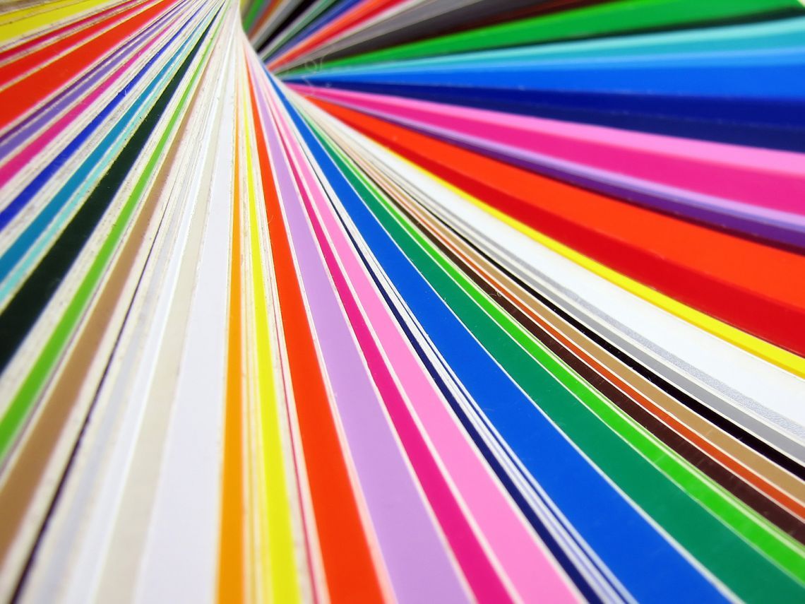
If there’s one market that makes the most of the human eye’s natural attraction to vibrant color, it’s the pet industry. On a shelf in a pet store you are more likely than not to see every color on the spectrum, from deep reds to bold chartreuses. People have emotional reactions to color before they can even begin analyzing what is happening in their brains. Given that such a large percentage of buying decisions are made based on color, you really can’t underestimate the importance of color choice for your packaging. While bright and bold colors are not right for every pet brand, there is a reason why so many pet companies gravitate toward brilliant brand colors. And Dion Label Printing has superior color matching abilities for both digital and traditional print methods, so your color choice will always have the highest impact when you print with us!
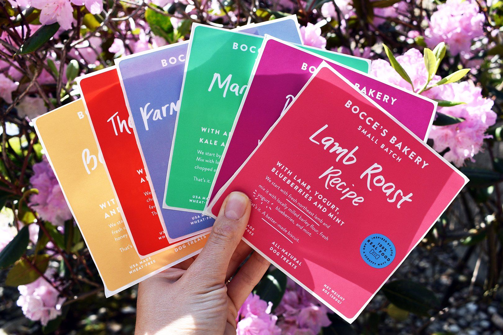
Bright and Vibrant – There is nothing quite like a boldly colored label to catch the eye of a customer. When you have a product line with several varietals, as many pet companies do, a fantastic way to make the most of your label and create brand recognition is by using a different color for each different product type or flavor. And while many companies in the pet market are using this strategy, it is essential to keep in mind that your products will likely be aligned one next to the other, so those colors should complement one another. When you are designing your bright and beautiful pet product labels, make sure you keep in mind how those colors will look together! People associate vibrant colors with fun, youth, and adventure, so if you make treats to reward a good puppy or toys to keep kittens active and youthful, bright label colors will help you communicate those ideals to your customers.
Natural Tones – Depending on your brand, bright colors may not be right for your product. For pet brands that identify as natural, organic, or healthy, a palette of neutral tones might make more sense. Earthy shades of green and tan are popular for health-promoting pet products. We love the idea of using a Kraft paper for your labels with a pop of green to communicate your brand identity. We at Dion have the capabilities to replicate a Kraft paper or a wood-finish look on paper or film with our outstanding digital print. We also offer a variety of post-consumer waste label materials that can go even further toward showcasing your brand values as a natural products pet company.
Psychology of Color – Whether you’ve decided that vibrant hues or a more neutral tone is right for your label, you want to keep in mind how far color will go in making an impression on customers. You likely are aware that greens are associated with health and nature while blues evoke calmness and security, but there are many facets to the psychology of color that you should take into account when designing labels for your brand. Check out this awesome
infographic from Hubspot for a more in-depth look at color psychology in marketing.
At Dion Label Printing, we are obsessive about getting color right on every label we print. We are totally attuned to how important color is for every brand, no matter its size, and we work tirelessly to make sure the colors on your final printed label are the ones that are right for your brand. Read more about our color matching abilities here!
RECENT POSTS