Labels We Love: Mount Mansfield Maple Products
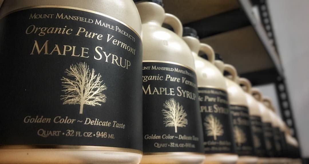
Mount Mansfield Maple Products has been producing pure Vermont maple syrup for generations. The brand wanted to create a high end look for their labels that would reflect the premium quality of their products and commitment to exceeding consumers’ expectations. Most maple syrup businesses use images of sugarhouses and farms on their products. While this communicates the roots of maple syrup production, Mount Mansfield Maple Products wanted to diverge from the competition with a label that shows off the sophisticated side of maple.
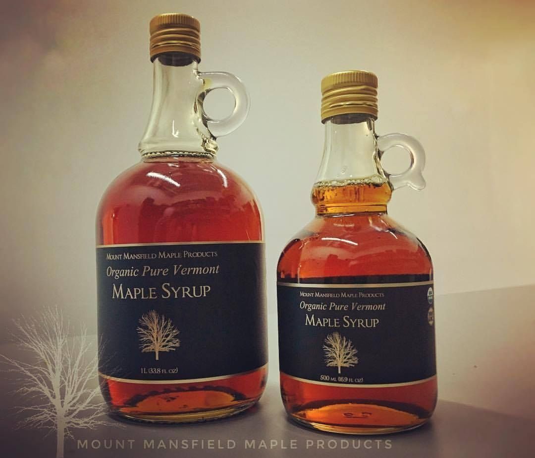
Photo Courtesy of Mount Mansfield Maple Products
As a result, the brand developed a black and gold themed label with simulated hot stamping and a beautiful, matte black background to contrast the gold design. The maple tree and its detailed branches stand out in gold against the black background and is the focal point for this label, which is something the company wanted to portray with the design. Their labels uphold the expected quality a high-end, organic product of this nature has with its consumers. The success with this branding has encouraged them to relaunch their conventional line with a similar look, but using blue and silver instead of black and gold.
Mount Mansfield Maple Products recently won two
Sofi awards for their labels! They won a bronze award in the
Confection category for their Pure Maple Candy and a gold award in the
Dessert Sauce or Topping, Syrup for their Single Malt Barrel Aged Maple Syrup. The Sofi Awards have played a critical role in honoring and advancing culinary excellence and creativity worldwide. The awards are like the Oscars to the food industry.
Congratulations, Mount Mansfield Maple! We are excited to see your redesigned labels!
RECENT POSTS