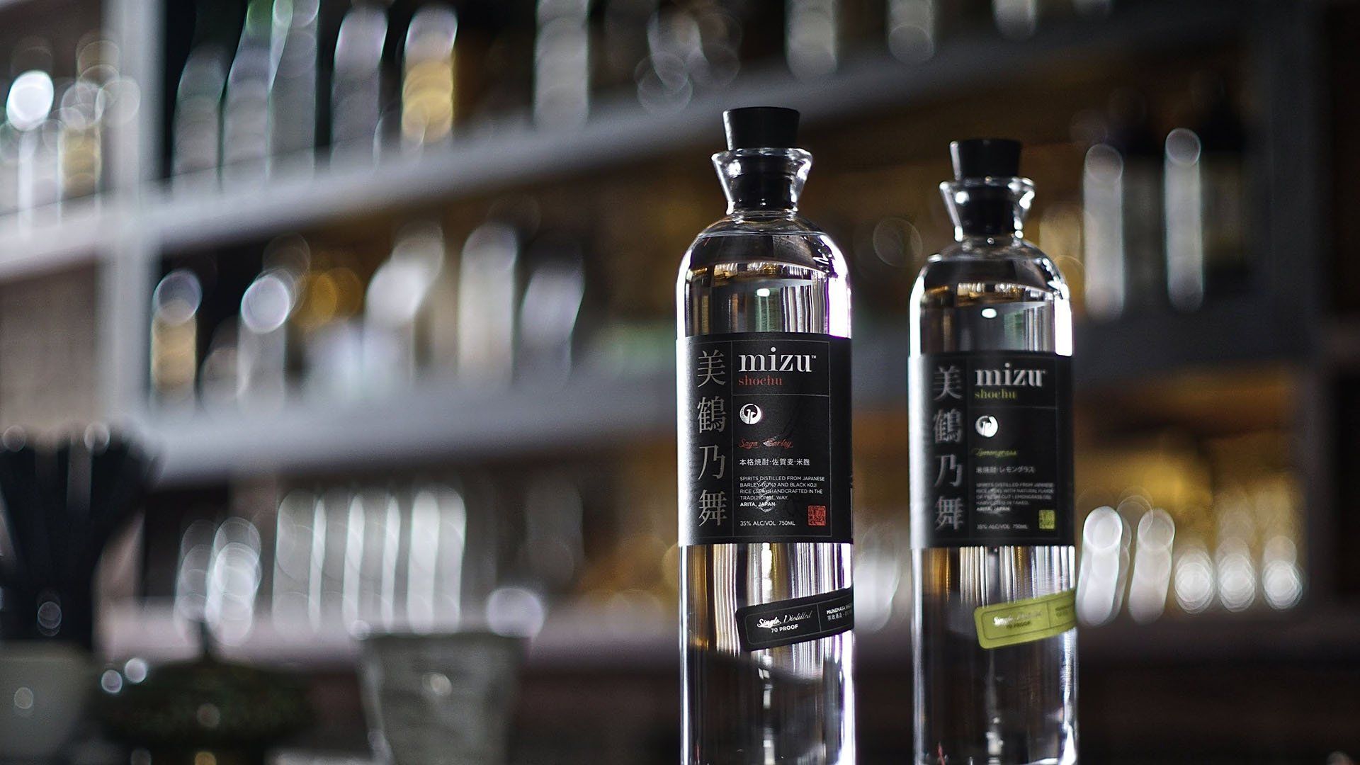
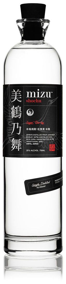
They start with a delicately textured matte black base, with mostly white font to share the ingredients, a bit about their tradition, and health information. There are a few elements in eye-catching colors that correspond to the variety of shochu, like a deep red for Saga Barley. The design is sophisticated and minimalistic, with Japanese characters included to give a sense of the spirit of the beverage. But Mizu Shochu takes it a few steps further, adding hot stamped elements, selective gloss, and back printing to emphasize their roots and the purity of their brand.
Sprawling across the label is a beautiful crane in flight, printed not in color, but with a selective gloss varnish that creates an understated yet powerful feel. It is evocative of the good fortune and longevity associated with this alluring creature that is so meaningful to Japanese culture. The crane reconnects the label and the product with the tradition from which it is based. Four vertical Japanese characters and the brand iconography are hot stamped in bright silver. The label also uses back-printing, so that a swirling arabesque pattern is visible through clear product, communicating the company’s intentionality in design.
When asked about the biggest challenge of this project, Jesse told us that “The subtle nuances of typefaces and typography in foreign characters required quite a bit of guidance and direction, and also lead to some debate between the Japanese and the non-Japanese members of the design team. We wanted to maintain authenticity and high appeal to our Japanese audience so their preferences had to be prioritized and worked into the design.”
The components of this label incorporate the best of high decoration printing techniques. They also manage to evoke the intersection of the simple with the refined, mirroring the mingling of the ancient process by which Mizu Shochu is crafted, the pure simplicity of its ingredients, and the artistry demonstrated in its production.
If you have a brand story you want your label to tell contact us today to find out how we can help!