Labels We Love: Nourishe Organics

Gina Lisella • Apr 07, 2020
Nourishe Organics products on earthy background


The health and beauty industry has an abundance of companies making products with spectacular label design. We at Dion partner with many of these brands and are used to seeing amazing health and beauty products labels come through our facility. Even so, when we first printed Nourishe Organics’ new labels, we all stopped to admire them. Kristin Bauer, ‘creates’ at Nourishe, decided to give her brand a boost with a new look and new labels, so she turned to the experts here at Dion. The result is an extensive line of skincare products made from authentic, organic ingredients with labels that embody the mission of the brand.

Nourishe Organic Floral spray on yellow background

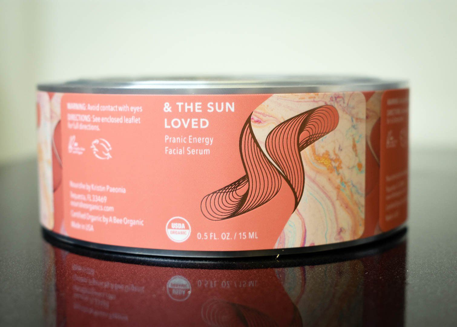
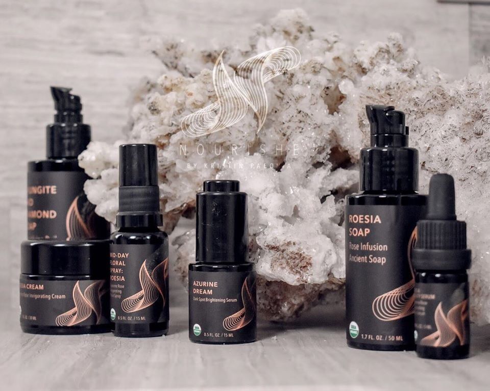
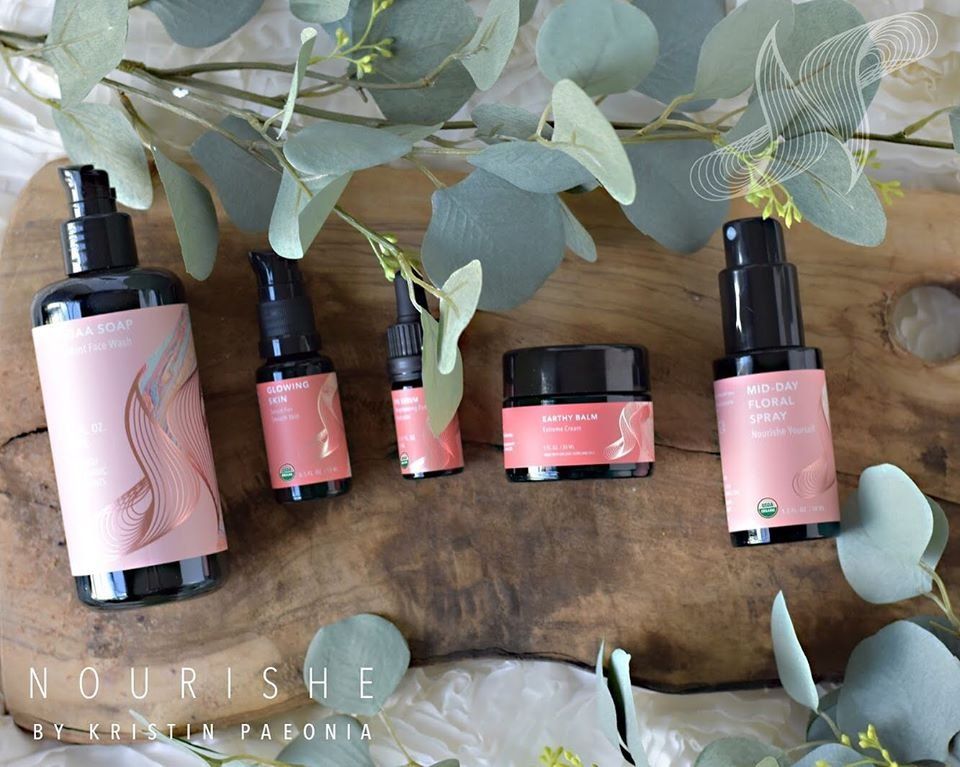
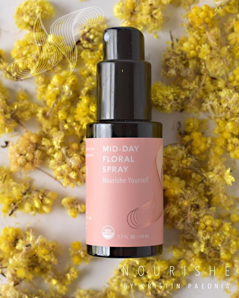
Nourishe Organics is, first and foremost, a brand at the forefront of leading change in the skincare industry by formulating products from truly natural, organic, ethically sourced ingredients and using science-based methods to foster healing and health. They focus their work not only on making great skincare products, but on promoting awareness around self-love and educating people about the toxicity of many mass-market skincare products. Their product line is extensive, ranging from at-home facial kits to serums, moisturizers, and soaps. Every product is unique, but their labels and packaging unify them all under the umbrella of incredible skincare products.


While the design of the labels themselves is gorgeous, what we love most about them is how they embody the spirit of the brand. Throughout the entire product line, Nourishe maintains a clean look with a solid color background and a simple sans-serif typography. This semi-minimalistic design harkens to the brand’s authentic organic ingredients. However, Nourishe adds a bit of character to each of its labels through an amazing geometric line pattern that shines in a metallic rose gold. This pattern makes a flowing “N” character, and both the color and shape swirl beautifully into the rest of the label. It is also perfectly aligned with the energetic aspect of the brand.

Nourishe Organics product with geometric design elements


The palette of pinks used in the background for most of the labels has a modern-feminine feel. Flowing into the “N” pattern, each label incorporates an elegant marbleized design. This marbleized pattern is made up largely of pale golds, pinks, and blues that complement the background colors perfectly. The marble itself elicits feelings of luxury, which is fully appropriate for a line of skincare products that puts the emphasis on “care.” But the marble is also evocative of the natural stone and the minerals that it’s made up of, harkening to Nourishe’s organic ingredients and their awareness of the human body’s natural healing processes. Overall, these labels communicate that you don’t need toxic chemical products to have a luxurious skincare routine and that beauty is about much more than superficial appearance.

Labels are our bread and butter, so we always love to see amazing designs from brands we partner with. We are even more impressed when our partner companies dedicate themselves to improving peoples’ lives. Nourishe Organics is doing an amazing job at both, and we are so excited to grow our relationship with them!

Interested in seeing physical samples of our print work for brands like Nourishe? Request a free custom sample packet today!

REQUEST A SAMPLE PACKET
Nourishe Organics luxury line product group


P.S. Nourishe has a luxury line of products coming soon! These labels maintain the identity of the brand with the geometric metallic lines that comprise the "N," the marbleized pattern, and the simple typography, but they add an extra layer of elegance with their black background. We can't wait to try them out!

RECENT POSTS

by Gina Lisella 05 Dec, 2023
Designing a label can be an involved process; logos, fonts, layout, material, and finish all must be taken into account. Then there’s the product-specific copy and information to include. It’s easy to get hung up on any or all of these things, but don’t forget to consider the importance of color selection While you may be choosing your colors based on your product or on your own color preference, you always want to make sure your colors are communicating the right thing to potential customers.
by Gina Lisella 30 Nov, 2023
Our friends at Ananda Hemp shared this excellent article to provide some insight into labeling requirements for hemp and CBD products!
Press operator printing labels
by Gina Lisella 21 Nov, 2023
As part of Inovar Packaging Group, Dion Label Printing is working to creating a world-class enterprise by building an innovative platform to drive sustainable growth and handle the increasingly complex demands of our diverse range of customers. Over the last several years, our parent company Inovar has acquired new facilities at a quick pace, including, most recently: Cimarron Label in Sioux Falls, SD and Amherst Label in Milford, NH. Acquiring is a major part of Inovar’s strategy to grow the company and better serve our customers and our internal teams, and we are concurrently working to expand our capacity, capabilities, and service offerings in other ways. To that end Inovar has recently moved into a newly renovated headquarters building in Dallas, TX. Located just a short distance from Inovar’s previous facility headquarters, the new location was built to showcase the mission of our brand. At triple the size of the last facility, this brand new building with its huge increase in both office and production space will enable us to provide even more solutions and support to our customers. The new facility is not just larger, however. In order to increase our capacity, capabilities, and offerings, and give our customers the highest quality labels and packaging solutions, we’ve added two new flexographic presses and a new digital press. Our Director of Marketing, Ashley Stewart, states, “the additional capacity, services, and embellishment capabilities will greatly increase our ability to meet all the requirements of even the most demanding brands. The team is thrilled to debut the new facility and showcase our capabilities to our existing and future customers.”  We also have other expansions in the works. An addition of almost 20,000 additional square feet of production and warehousing space will expand Inovar’s Milwaukee, WI, location, Flexo-Graphics, and its presence in the area. We are excited for the opportunities our growth provides us to continue our rise as a premier label and packaging solution provider. Contact us today and let our growth help fuel yours.
Show More
Share by: