The Shift Towards Gender-Neutral Packaging
Different products have been marketed toward different audiences since the advent of mass consumer spending. Since customers have different needs, desires, values, and concerns, having a target audience is an integral part of the territory of selling things. Many brands, however, have long defined their audiences with a heavy reliance on gender roles. Pink was for girls, blue was for boys. While in the personal care, toy, and household products industry this gender-specific marketing was particularly pronounced, it really extended throughout all markets, from food and beverages to beer and beyond.
Over the last few years there has been increasing resistance to gender-specific consumer packaged goods, and a new trend has emerged toward gender-neutral packaging. New brands in the personal care industry have been the most visible and vocal about steering away from out-of-date gender tropes, but regardless of company size or product offering, many brands have recognized the importance of rethinking how they are using gender-specific marketing.
There are complex sociological reasons behind the demand for gender-neutral products, so it’s essential for brands to consider their identities as a whole before making superficial changes to packaging and label design. It’s a mistake to try to trick increasingly informed customers who have more access to products than ever before by changing out a color here or there. But once you’ve decided that being more inclusive is a principle you uphold and you’re ready to reach a wider market with your product, gender-neutral label and packaging choices are a superb way to communicate your values to potential customers. And as
Design Analytics puts it: “Let’s face it—unisex sells.”
Our partner
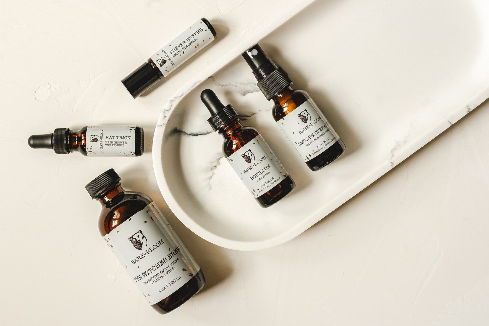
Bare + Bloom (pictured above) does an incredible job through their website, social media, and their labels and packaging to demonstrate that they are an inclusive brand. They create natural hair and skin care products including everything from shave butter to under eye serums. Since they are authentically inclusive and their products are neither created for nor marketed to groups based on gender identities, they don’t even have to include words like “unisex” on their products. Instead, their product focus is on identifying and solving problems everyone who has skin or hair encounters, regardless of their gender. Their minimalistic label design, made up primarily of whites, blacks, and golds, is beautifully evocative of the modern, sustainable, and inclusive values that are integral to the brand.
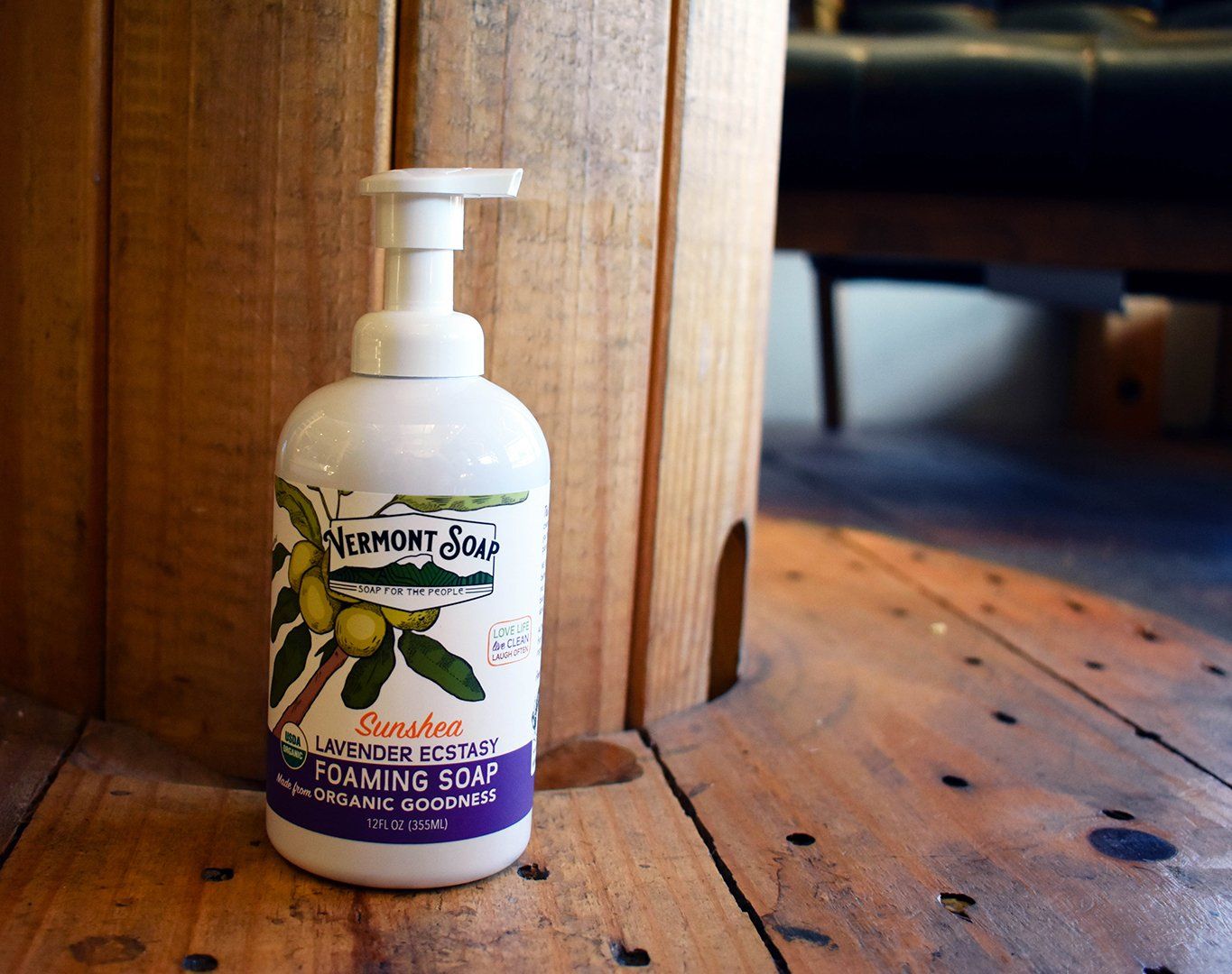
Vermont Soap is another brand who creates and markets their products based on things like skin type rather than gender. After all, everyone washes their hands and bodies, and the concerns that may arise for a person looking for soap are likely to be around ingredient sensitivities or dry skin, not whether they are male or female. Their labels are entirely gender-neutral, with clean, neutral color palettes and iconography related to ingredients. The slogan “Soap for the People” is a prominent part of their logo, demonstrating further that their soaps are for everyone.
Packaging and label design create a consumer’s first impression of your brand. Make sure you are communicating the right things with a high-quality label from Dion Label Printing. Check out our
Label Design Trends Guide if you’re interested in learning more about what’s trending in the world of label and packaging design!
RECENT POSTS