Labels We Love: Silver Harbor Brewing Company
When a passion project transforms into a successful business, the results are often impressive. Such is certainly the case with Silver Harbor Brewing Company. For 5 five years, Christian was a diligent homebrewer, and he took the process seriously, enjoying every step from the science to the aromas of brewing to the finished product. Now, as Brewmaster of the gorgeous Silver Harbor Brewing Company in St. Joseph, MI, he’s committed to brewing beers that focus on quality, creativity, consistency, and variety.
At Silver Harbor Brewing Company, their motto is “Eat. Drink. Beer Happy.” They believe that beer should be an experience, and they offer a range of brews and options for you to make the most of yours. While their facility is incredible and they offer one-of-a-kind drinking experiences in the form of live smoked beer (check out their website for more information on that!), for those of us who can’t make it to Michigan, they offer their brews in cans as well.
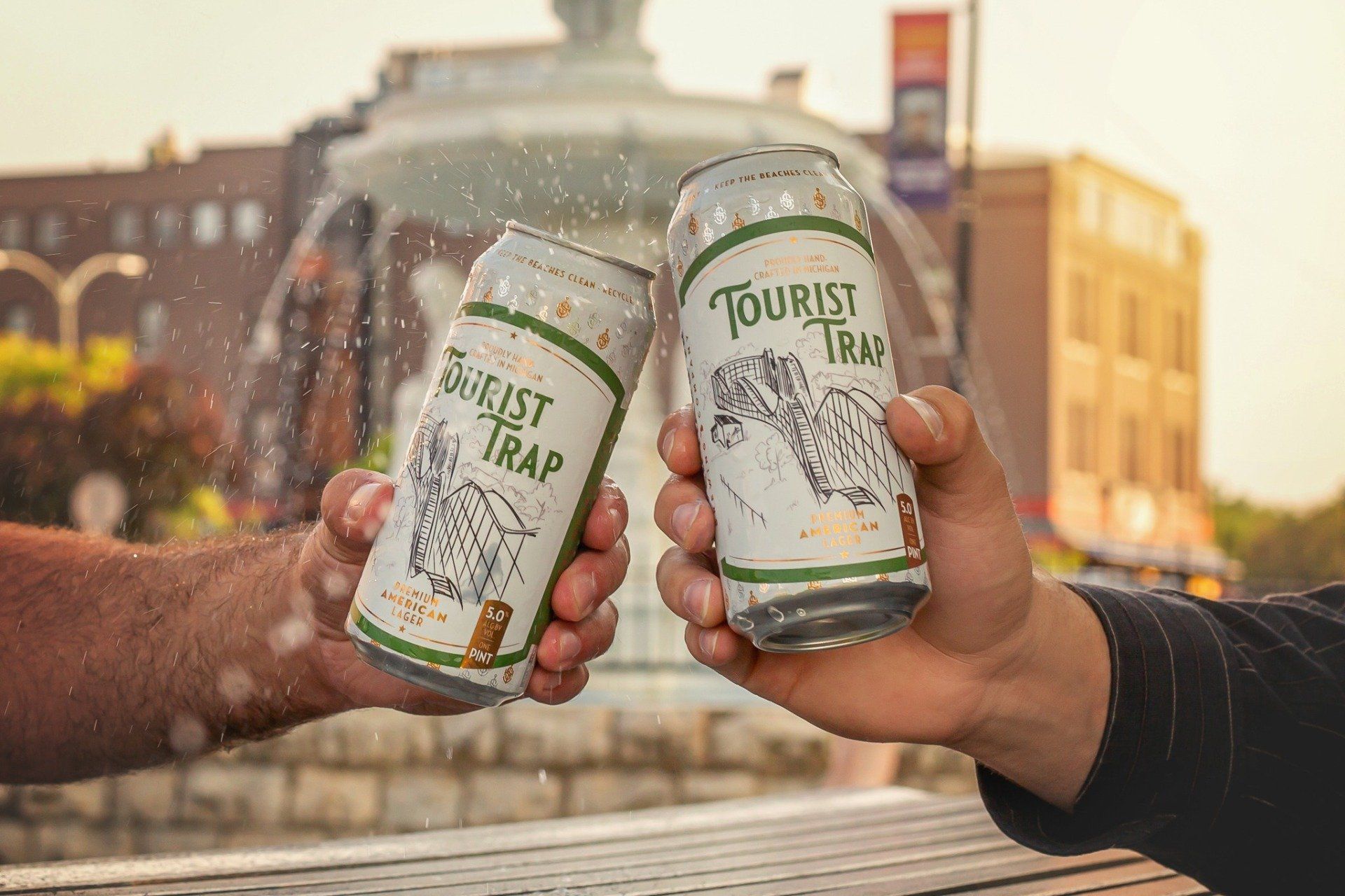
Like the rest of the brand, their labels are unique and thoughtfully created. They have two main types of labels: the first use a custom diecut and one main color, and the others are made up of lovely full-color art. Here we’ll focus on the labels with the custom diecut featured on their Small Batch Series.
One of the first things you notice when you grab a can of Silver Harbor Brewing’s libations is that the cans are different. White and printed with silver and gold logo icons, the cans themselves are a feature. Not many beer brands go for both a printed can and a label, but Silver Harbor recognizes the importance of standing out in this crowded market.
To make the most of labeling their branded cans, they use a custom diecut on their Small Batch Series. While the effect is subtle and the shape almost nostalgic, it shows just enough of the logo icons at the top of the can to make its impact felt.
The labels also include what look like pen and ink drawings of something that reflects the beer’s name: a treasure chest for “Blackbox,” a Volkswagen Beetle for “Psychedelic Pils,” and a bridge for “Wobbly Traveler.” The art is lovely and gives each can a personal touch that aligns with the small batch brew they represent.
While the background of the labels is mostly white, each one features a main color or color pattern for the beer name and as an outline and background to the description of the beer. The colors are thoughtfully chosen to reflect the mood of the beer with tie-dye for “Psychedelic Pils” and a woody/rusty textured pattern for “Wobbly Traveler.”
In the craft beer industry, there is so much room for creativity, and we love how Silver Harbor Brewing Company creates unique, beautiful labels while maintaining their brand identity across many different products. We love to partner with brands who put as much thought and care into their products as we do. If you’d like to learn how we can help boost your brews, request a quote here to get started!
RECENT POSTS