Connecting the Design of a Limited-Run Varietal to an Established Family of Wines for Black Birch Vineyard
When it comes to unique and spectacular label design for wine, Black Birch Vineyard and their design partner BRIGADE have plenty of experience. Black Birch Vineyard is a celebrated winery located in Hatfield, Massachusetts. Creative agency BRIGADE, also based in Western Massachusetts, has partnered with Black Birch since the beginning and provided design and production support as the vineyard expanded operations and grew their brand.
Founded in 2012, Black Birch Vineyard moved to Hatfield, MA in 2017 to expand their vineyard and their vision. They have over 19,000 vines stretching across 12 acres of rich Connecticut River Valley soil, giving them access to over 10 varietals of grapes. Because they plant their own grapes, they are part of every stage of winemaking: from growing and harvesting, to aging and bottling. They provide high quality wines that explore the nuance and artistry of winemaking by highlighting the best of what Northeast terroir offers. Their vineyard was founded on the belief that truly great wine should be an art form, requiring much more than lab specialists and computerized fermentation charts. Since 2012, they have created five award-winning wines using best grapes from the cooler Northeast region.
At the very beginning of their partnership, before approaching the label design for Black Birch, BRIGADE spent days at the vineyard soaking up the meaning, the sensation, and the ethos of what Black Birch owners Ian and Michelle were looking to create with their brand. The design team immersed themselves in the process by crushing grapes, rolling wine barrels, and sampling wine while deriving inspiration from the brand’s commitment, drive, and attention to detail. Black Birch Vineyard was looking to produce award-winning wine in a region otherwise untapped and unconsidered for the craft of winemaking–and they needed their labels to portray their message.
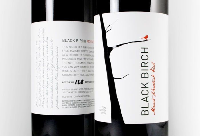
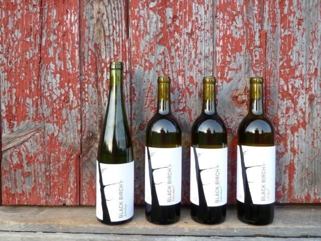
Black Birch Vineyard describes themselves as “modern, simple, yet beautifully detailed with a touch of whimsy”. BRIGADE wanted to design their labels in a way that connected with the brand’s whimsical personality, so they homed in on specialty die cuts. Many of Black Birch Vineyard’s varietals include a unique die cut that forms the shape of a tree when wrapped around the wine bottle. BRIGADE was inspired by the lack of prosperous vineyards in the northeast, which sparked imaginative thinking when considering the label’s die line. This gave them the ability to tell a story using glass, paper, and negative space.
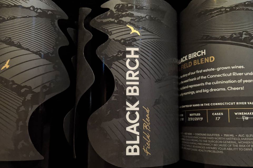
As Black Birch continued to grow and succeed, they began to expand their offerings to include limited edition Estate Blends on top of their robust line of reds and whites. For these labels, BRIGADE continued with the custom die lines, only this time they took it a step further. Rather than a die cut tree, these labels are cut to mimic the actual contours of the Connecticut River and backdrop of hills. What’s more, BRIGADE added areas of selective gloss varnish to showcase the fields that make up the background of the design. The contrast between the high-gloss elements and matte background creates a unique effect that exemplifies the spirt of the wine and the vineyard.
In 2020, Black Birch bottled their first sparkling wine, and went to BRIGADE for a label that would stand out from their regular line-up of varietals while maintaining brand consistency overall. BRIGADE explains their approach to the design process for these new labels: “To evoke the celebratory feeling of popping a cork on a beautiful night, we centered the design on an elegant, starry sky with a glossy, almost iridescent sheen, metallic foil type, foil star accents, and a matte silhouette of the rolling hills that surround the vineyard. We maintained brand consistency with other limited-edition varietals and Estate wines by using consistent brand elements and production techniques. As a result, this label is a beautiful representation of the brand, its local roots and the wine itself — effervescent and classic.”
A third long-term partner hailing from Western Massachusetts, Dion Label Printing has always worked closely with Black Birch Vineyard and BRIGADE to ensure their design aspirations can be realized through print. The 2020 Brilliant label was no different, and it created some unique challenges. It was constructed with a silver BOPP base, with matte lamination for the hills and a selective UV gloss varnish for the sky and star elements. To achieve the realistic and sparkling look of the night sky, Dion used white underprint with screens or gradients. Without having to resort to high-cost foil stamping but to still achieve a high contrast against the night sky, the stars are printed with different levels of white print; the stars with less white allow the silver metallic base to shine through more and sparkle, creating a realistic effect mimicking the variable brightness of stars in the night sky. the stars are full 100% bright, and at the bottom of the valley dip they have a denser screen of white so they radiate more.
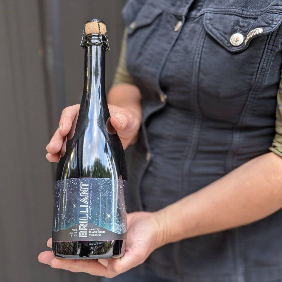
Dion created 5 options for BRIGADE and Black Birch to select from; each had different versions of the blue gradient sky color and where it was going to fade. The design team eventually opted for the selection that had some high contrast where the color was lighter at the base of the mountains near the bottom of the label and darker toward the top. This label was different from many of Black Birch Vineyard’s other designs, created with a heavier emphasis on graphics rather than a unique diecut, but it still maintained the hill imagery that had been established with the Estate blends. The final product also perfectly evokes the bubbly nature of the sparkling wine itself.
In the competitive boutique wine market where outstanding label design is the cost of entry, everyone involved in the creation of Black Birch Vineyard’s Brilliant label knew they had to extend the bounds of design and print. To keep the label on brand, BRIGADE worked diligently to make sure elements from other varietals were present while creating a unique label that exemplified the spirit of this sparkling libation. Dion Label Printing worked through the technical elements of digital printing to accomplish the design goals, and Black Birch Vineyard crafted yet another superb wine.
RECENT POSTS