The Top 5 Label Design Trends of 2021
Design trends don’t often change dramatically from year to year, but we predict that 2021 graphic style is going to be quite different from that of 2020. Last year label design was all about the bold, from geometric patterns to brightly colored gradients. This year, authentic, simple design is the way to go. Here are 5 label design trends that will be on the rise in the coming year.
1. CLEAN AND SIMPLE
Minimalistic design has been popular for some time, but you can expect to see even more no-frills design in 2021. It’s not surprising that after the intensity of 2020, many consumers are looking for a little simplicity in their products, from their ingredients to the processes that go into making them. The shift in consumer buying habits that heavily favored natural brands people view as authentic has also continued to grow. To that end, it’s essential to make sure your label communicates the right things about your brand. Bold and heavy patterns, fonts, or styles may make consumers associate your product with the over-processing they are looking to avoid. Instead, opt for neutral colors, clean lines, and unadorned fonts.
2. ELEMENTS OF NATURE
On a similar note, since people are increasingly searching for natural products, why not include some features of nature right into your label design? Including graphics of natural elements like leaves, flowers, or water drops is a fantastically clear way to communicate the natural origins of your product. These graphics can be realistic images of nature or simple drawings or icons that are replicated throughout your design. Using natural elements can have the added benefit of sharing ingredient information with busy customers who may not have time to read an entire ingredient list before making their purchasing choice. Of course, make sure you’re honest and authentic in your choice of natural graphics to include in your design!
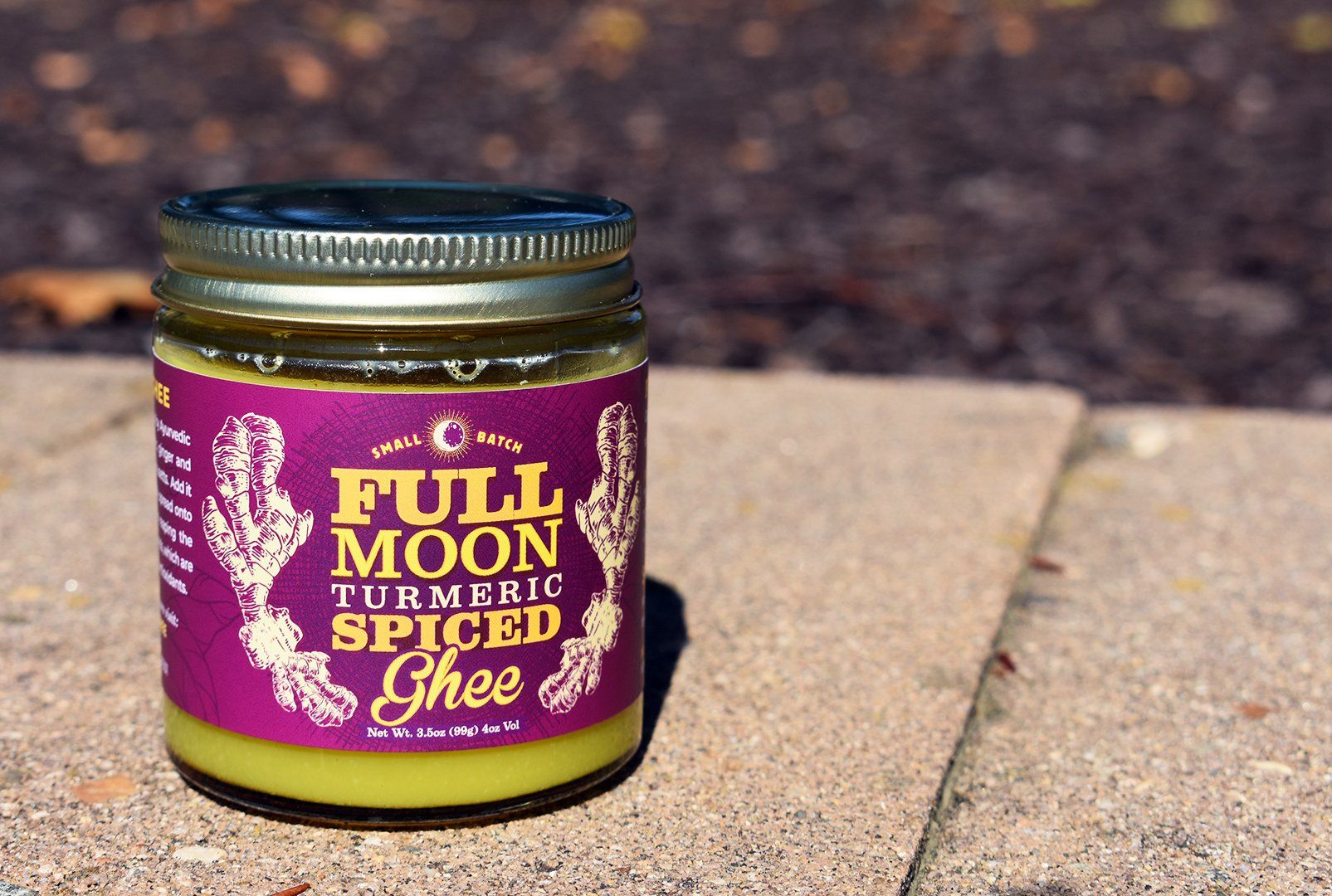
Full Moon Ghee uses drawings of real turmeric root as a lovely design element on their Turmeric Spiced Ghee labels
3. RETRO AND VINTAGE
Retro and vintage design is not something that is new this year, but you can expect to see a resurgence of styles that hearken back to earlier decades that seem simpler. In 2020, we saw lots of the pixelated graphics and technicolor patterns popular in the ‘80s and ’90s, intended to spark nostalgia in consumers (especially millennials). This year be on the lookout for vintage design that is more aligned with the trend toward simplicity, such as vintage botanical imagery. We all get a little nostalgic from time to time and using your label to remind people of a long-ago age may be just what you need to attract customers.
4. FINE ART FEATURE
If you’re itching for something a little bolder, consider incorporating some actual art into your label. There is no right or wrong way to add art to your label design; it could be in the form of hand-drawn illustrations or even reproductions of paintings. Remember to think about who your customers are when using art in your design—including graphics in the style of Pop Art from the 1950s is not likely to resonate with young people from Generation Z as much as it will with Baby Boomers. But don’t underestimate the power of unique art to tell your story.
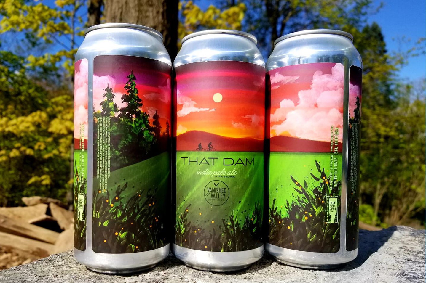
Vanished Valley Brewing uses custom artwork from local artists for many of their can labels
5. MONOCHROME
While some brands will certainly still find use for vibrant color palettes, if you’re looking for a simple way to draw attention to your product, consider monochrome label design. While monochrome design may seem constricting, there are actually no bounds to the creative opportunities available with limited color use. From simple black and white, which can be especially eye-catching on a crowded store shelf that is overloaded with color, to selecting a single color that is aligned with your brand, monochrome design offers the occasion to appeal to customers who are desensitized to bright colors in label design. Using only one or two colors on your label can actually make more of a statement than twenty!
The name of the game when it comes to label design in 2021 is to simplify and be true to your brand identity. As always, the team of label experts at Dion is here to help you accomplish all your label design goals with our superior print solutions. Request a free sample packet today to see all our capabilities to print high-impact labels!
RECENT POSTS