Vermont Vermouth: A Local Libation that Transcends the Traditional
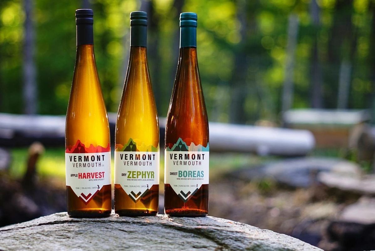
Photo Credit: Little Pond Digital
The last few decades have seen craft beverage creators pop up across the United States for all types of libations. While the most prevalent growth has been among craft breweries, spirit distillers have not been far behind. But vermouth makers…what exactly is vermouth anyway? Commonly used in classic cocktails like Manhattans and Martinis in the U.S. and as an aperitif in many European countries, vermouth is a fortified wine with blends of herbs and spices.
Kobey Shwayder, a PhD in linguistics who has been a flavor enthusiast all his life, decided it was time to make the transition from the conceptual world of academia to the more concrete territory of fermentation and potable crafting. The transition was an easy one given his passion for home cooking; from making home-made spice blends and brewing beer to crafting a unique vermouth was a natural progression for Kobey. Thus, in 2019, was born Vermont Vermouth.
What differentiates Vermont Vermouth from mass market options is its commitment to locally sourced ingredients in and around Brattleboro, Vermont. Not only is the wine itself made from cold-tolerant grape varietals grown in the region (a tall order, as any New Englander knows!), but Vermont Vermouth also sources as many botanicals as possible from Vermont farms. While creating a delectable vermouth was essential to Vermont Vermouth, it was equally important that the flavor reflected the local territory and that the brand was true to its Green Mountain State roots.
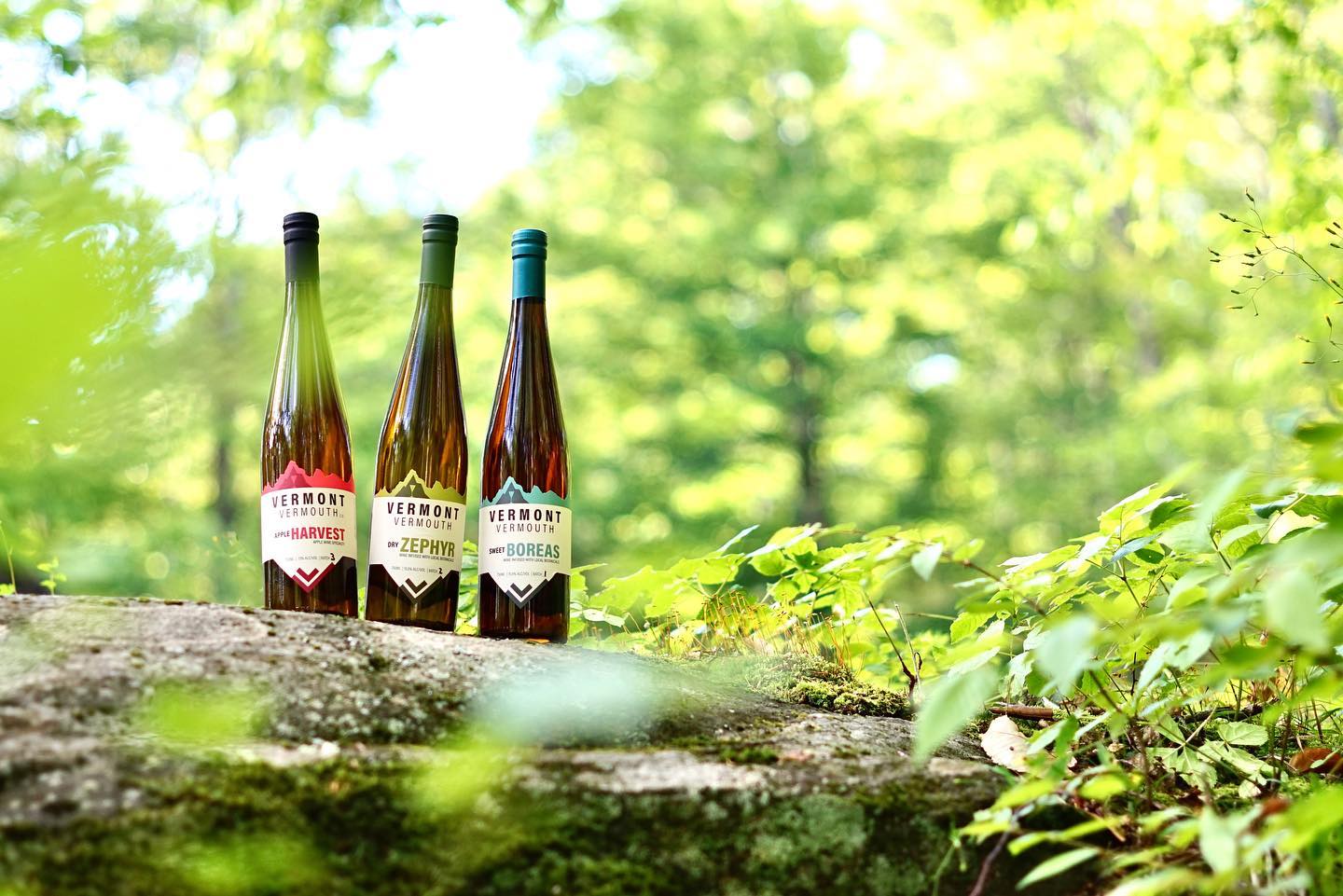
Vermont Vermouth’s line of libations begins with juice from fermented Vermont La Crescent grapes. They then add curated blends of local herbs and spices to create two different styles of vermouth. Their dry vermouth, Zephyr, is steeped with rosemary and yarrow to complement La Crescent’s herbal and citrus notes. Their sweet vermouth, Boreas, is a winter warmer, with savory-sweet tones from mugwort, yarrow, juniper and bay leaf balanced by caramel, allspice and cinnamon. Vermont Vermouth also makes a third vermouth-styled apple wine that is steeped with harmonious notes of caramel, cinnamon, and allspice.
Photo Credit: Little Pond Digital
Once the vermouth making process and taste profiles were perfect, it was time to solve for packaging and labeling. The origins of vermouth harken back to the 18th century and its popularity as a cocktail mixer began to burgeon in the late 19th century. Given this history, and its traditional use as a medicinal elixir, many vermouth brands incorporate vintage iconography and textual elements into their labels. Especially common are arabesque botanical patterns and heavy reliance on textual descriptions and multiple fonts reminiscent of antique medicine labels. Despite the strong tradition for this type of design for vermouth packaging, Vermont Vermouth knew that a more modern approach consistent with their reliance upon local ingredients would be more appropriate for their brand of vermouth.
Vermont Vermouth sought a design partner to help them realize their vision for a vermouth label that was true to their brand. Luckily, in Vermont there are more than a few wonderful creators who recognize the importance of authenticity and locally sourced products. Rebecca Lotka was one such person who was greatly inspired by the natural surroundings of Vermont. Founder of Little Pond Digital, Rebecca conceived the design firm out of a desire to capture and share the spirit of place. Little Pond Digital’s goal is to connect people and the community of businesses that make small towns go round, drawing inspiration from the craft and knowledge of talented and creative entrepreneurs producing excellent and unique goods. Little Pond Digital, also located in Brattleboro, Vermont, was a perfect fit to help Vermont Vermouth accomplish the last piece of their company’s journey: the look.
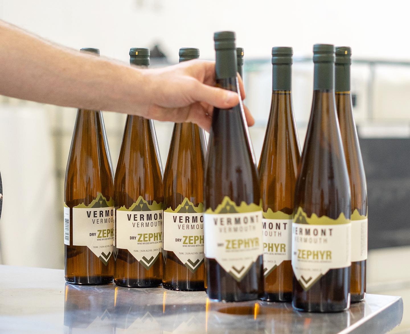
After selecting olive or amber-tinged bottles with a sleeker and slimmer design than most traditional vermouths, Little Pond Digital got to know the brand and set to work on the label design. Given that the product itself was unique, it was obvious from the beginning that the label could not be standard. And it of course had to pay tribute to the vermouth’s creation in Vermont and of Vermont ingredients.
The first step was to determine that a modern feel was most appropriate for this potable with aspirations to introduce a new generation to the art of cocktails from the past. They opted for a sans-serif font collection in lieu of the decorative and script typefaces common to many vermouth labels. The copy on the label is minimal, including only the brand name, type of product, the appropriate size and alcohol information, and batch number.
For color palettes, Little Pond Digital and Vermont Vermouth decided again that a modern was the way to go. The background color on all the labels is off-white and many of the textual elements, including the brand name, are printed in black. Each varietal has its own color scheme consisting of one color and a darker shade of that color for contrast. The mountain iconography and product name are printed in color. For the Sweet Boreas it’s a teal blue that harkens to the juniper berries used in the concoction. For the Dry Zephry, the main color used is an olive green, perfectly indicative of its special botanical blend. And for the Apple Harvest Wine it’s an orange-red, of course.
Photo Credit: Little Pond Digital
The most important design element of the label, however, is its custom die-cut. The top of the die-cut mimics mountains, entirely befitting this Green Mountain State brand. Most of the bottom of the label follows a typical horizontal cut, but it culminates in one convex triangular shape. At the bottom of the triangle are some geometric heavy line patterns in the corresponding variety’s color, adding a bit of design flare to an otherwise minimalistic label.
Rebecca Lotka of Little Pong Digital summed up their design process for the label: “Little Pond drew inspiration from the green mountains of Vermont, loosely basing the silhouetted landforms on one of the many things that makes Vermont so special. Breaking out of the conventional outline of label design felt important, as bold attention grabs are needed to compete in a busy visual market. An earthy, bold, modern-bright color palette distinguishes one Vermont Vermouth variety from another, while still providing a cohesive shelf for brand recognition and simplicity.”
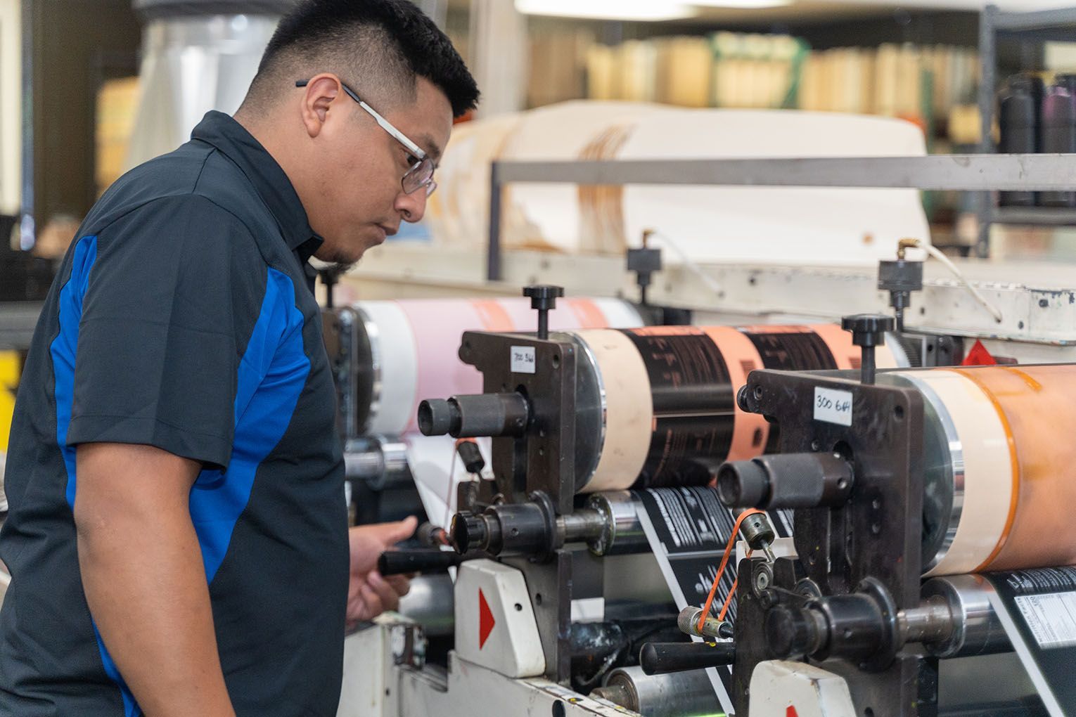
But the label, especially its complicated die pattern, couldn’t be accomplished without one more partner. Western Massachusetts-based Dion Label Printing was able to work closely with Vermont Vermouth to ensure their design aspirations could become a print reality. Located across the state line but less than an hour’s drive away, the Dion team was another company whose commitment to supporting local creators made them a well-suited fit. A Dion Label Solutions Specialist recommended a linen label stock to add a slight touch of textual appeal to the labels, and Dion’s technical team was instrumental in creating a die that would be functional while incorporating the detailed mountain pattern of the design. After some fine-tuning of elements among the Dion Label, Little Pond Digital, and the Vermont Vermouth teams, everyone was thrilled with the final product.
Taken as a whole, the label design for Vermont Vermouth evokes the spirit of the brand beautifully: a modern craft spirit made from local ingredients that prioritizes the brand’s commitment to their regional origins. Not as obvious, but equally important in the creation of the final product, was the cooperation of three local companies who recognize the value and importance of their region and of supporting other local makers. If you'd like to get started on a label project with a partner who can help you achieve all your design goals, request a free quote here!
RECENT POSTS

WHO WE ARE
our solutions
our WORK
RESOURCES
DION LABEL PRINTING
FACILITY/MAILING
539 North Road
Westfield, MA 01085


