Labels We Love: Brick and Feather Brewery
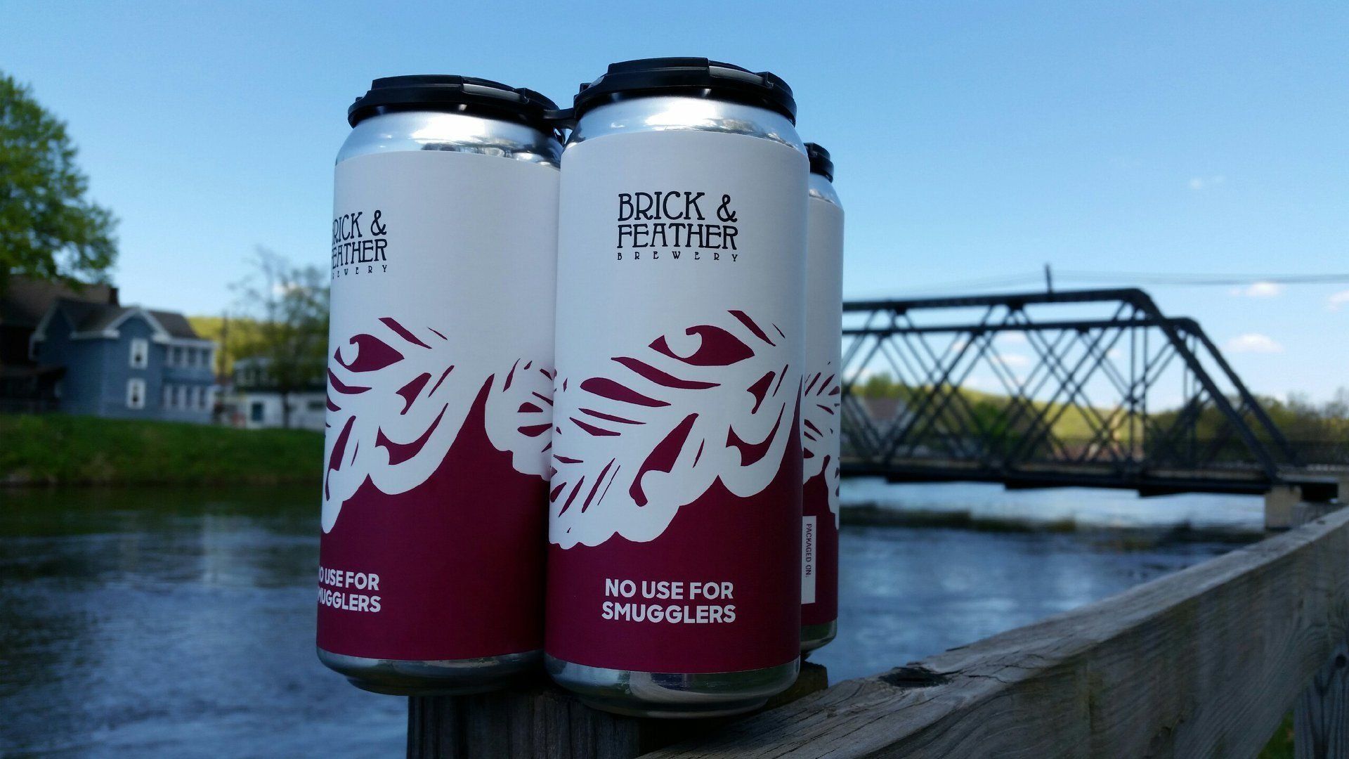
Brick and Feather Brewery, a small town brewery nestled away in Turners Falls, MA, was looking for a simple, distinctive and elegant image that would serve as the design identity for the brewery. Owners Lawrence and his wife were inspired by old art nouveau drawings and the stray feathers they would find in dusty warehouses while searching for a location for the brewery. Their designer, who they have been working with for three years now, hand-drew the feather in their logo and they instantly fell in love with the image.
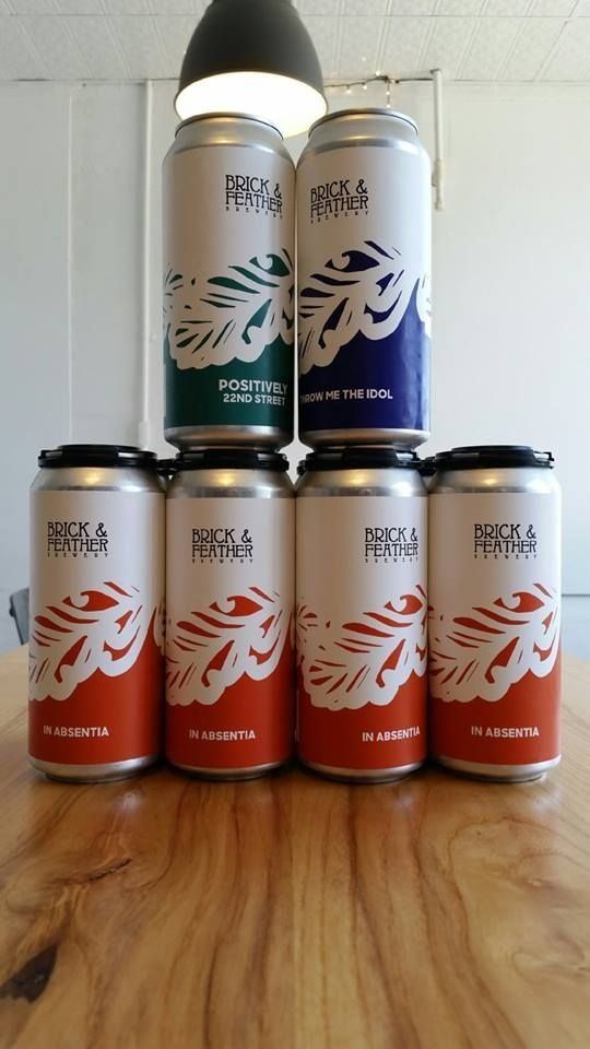
Photo Courtesy of Brick and Feather Brewery
Their beer can labels are consistent throughout and each label has a two-color toned palette, half white and half color. The white space on the label shows the hand-crafted feather illustration, an important feature relating back to the brewery’s name. When it came time to design the beer can labels, they tried many different approaches. At first, they chose something very complex and busy, but eventually went back to the simple prototype used for their current labels. They use the same basic template for each beer can label, changing the colors and some text for each.
We love these labels and are excited to see future designs as the brewery continues to add new beer varieties. If your brewery needs a label, whether it be for cans or bottles,
contact us today for a quote!
RECENT POSTS