Labels We Love: Agronomy Farm Vineyard
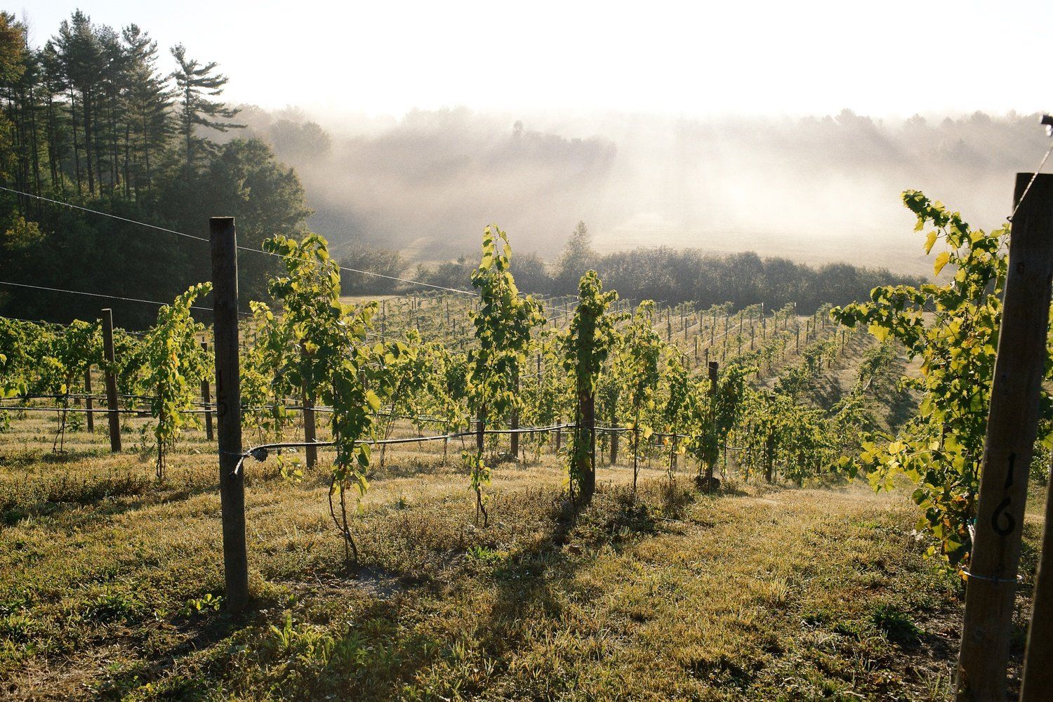
Perhaps central Massachusetts is not the first place that comes to mind when you think of amazing wine terroir. Agronomy Farm Vineyards’ wines, however, demonstrate that with a little science and lot of passion, you don’t have to be in Sonoma County or the Loire Valley to grow and make delectable wines. Their vineyard was planted in 2014 in Oakham, MA, and from their beautiful tasting room to their picturesque fields, this vineyard is a manifestation of Corey and Marissa O’Connor’s desire to bring nature, friends, and high-quality handcrafted goods together. And did we mention that their labels are gorgeous?
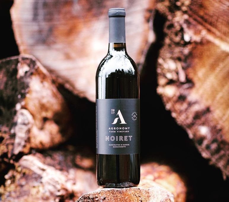
Two of Agronomy Farm Vineyard’s wine labels are noteworthy in juxtaposition to one another: their 2018 Sound & Color Rosé and their 2017 Noiret. While each varietal has a label that is unique to the wine, they both share features that are indicative of the brand, like a wine glass icon that tells the temperature the wine should be served at, the definition of “agronomy,” and a clean sans-serif typeface. They are both printed on metallic film with a matte coating, but each of them is composed of elements that are designed to align perfectly with the wines inside the bottles.
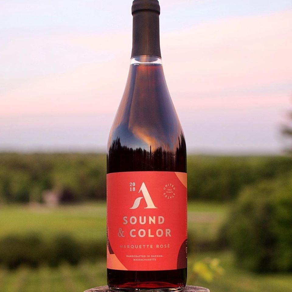
Sound & Color is one of Agronomy Farm Vineyard’s newer wines and their first rosé. It was crafted from 100% Marquette grapes. With bold color and flavors of ripe strawberry & cranberry, it’s a wonderful wine to enjoy on a hot summer afternoon. The label for this bottle perfectly embodies the facets of the wine itself. The majority of the label is brightly printed in coral and plum reds with accents of peach. It’s impossible to look at the colors and not think of the bold fruity flavors of the wine, even before you taste it. It is printed on a metallic film, and the “A” of the Agronomy Farm Vineyard logo as well as the name of the wine are light gold, while the rest of the text uses a very pale peach that makes the brighter colors pop even more.
The Noiret label, on the other hand, uses a greater amount of metallic typography; in fact, all of the textual elements on this label are light gold. In contrast to the bright bold colors of the sound and color label, this one’s background is entirely black. The black and gold design of this label is indicative of this medium-bodied red wine’s tasting notes of coffee and cocoa. While Sound & Color’s label lets you know right away that it’s a wine that will be best enjoyed as refreshment with perhaps a light meal of chicken, the Noiret label communicates that it is best paired with the more robust flavors of red meats and dark chocolates.
We love local, family-owned companies who work to bring community together and are thrilled about our partnership with Agronomy Farms Vineyard. If you’re looking for an amazing label for your winery or are a local business searching for new ways to expand your reach, Dion is here for you. Request a free sample packet to see some examples of the print work we do for our other local partners like Agronomy Farm Vineyard.
RECENT POSTS