COMMON LABEL MISTAKES AND HOW TO AVOID THEM
If you’ve ever worked on a design project of any kind, you’re probably familiar with this scenario: you reviewed your work multiple times, shared it with team members or even an external source for several rounds of edits and reviews, quadruple checked everything one last time, and somehow a mistake still made its way into the final product. You’re not alone in this experience; if you’re feeling bad about errors on your labels from the past, read this great article from Beauty Independent wherein brand owners lament past label mistakes, and know that printing with Dion can help mitigate these errors in the future!
The feelings you get when oversights occur are never positive, but the intensity of the sinking sensation associated with this type of blunder really depends on the medium the mistake is on and the severity of the mistake itself. If it’s a small typo in a marketing email, you can blush slightly and cross your fingers that it will be overlooked. But if you’ve just had thousands of labels printed and you spelled your own brand name wrong? Yikes!
Luckily for you, the Dion team works diligently to help make sure your printed labels look just how you envisioned. Our proofreaders do manual copy and graphics checks of all artwork that comes in with label orders. They are trained to spot things that just feel “off” but are not technically mistakes as well as common spelling and grammar errors and the like. Whenever our proofreaders find something that may be an issue, they create a new proof and send it to you for approval. Communication is integral at this stage, and our art department works closely with our customer support team and you to ensure that most errors are corrected long before your labels go to press.
It is possible that you could have an ingredient or regulatory change that we are not aware of or you could be including technical information that we are not experts on, and so we can’t guarantee there will never be a scenario in which your labels print with incorrect information. However, we have an extremely thorough quality control process in place and chances are good that we will catch typical errors. When we send you a press proof, this is the best opportunity for you to review your label art with a fine-toothed comb one last time before your label goes to print!
Here are three types of mistakes we see frequently, and some tips on how we can help you avoid them:
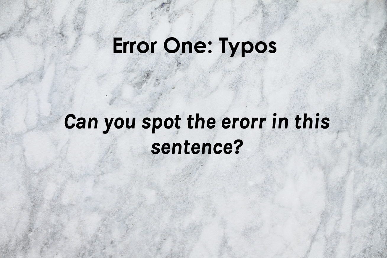
ERROR ONE: TYPOS
Certainly the most common error we encounter, typos are the bane of otherwise brilliant writers and designers. They happen to all of us, of course, but that doesn’t make them any less embarrassing, especially in business. When a typo occurs on a product label, it can make you look careless, amateurish, or even sloppy, and it could easily be the factor that decides a customer in favor of another brand over yours.
When you print with Dion, our teams work diligently to help make sure every aspect of your label meets our intense standards for quality and exceeds your expectations. Our prepress and quality assurance departments play an integral role in making sure all aspects of your label read exactly right so that the label you envisioned is the label you receive. Our proofreaders will review your copy line by line, and let you know if they find anything that looks incorrect, usually nipping those pesky typos in the bud!
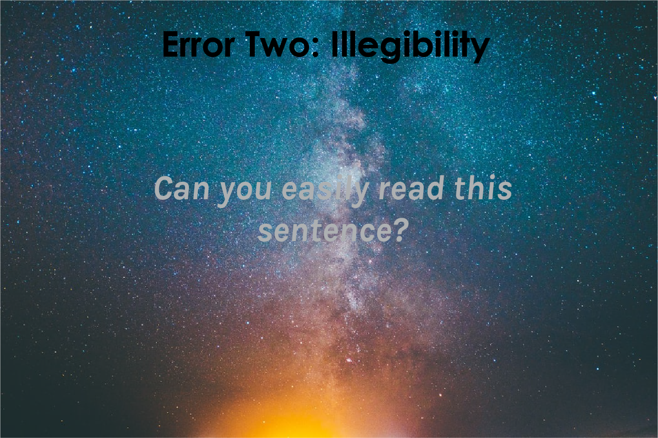
ERROR TWO: ILLEGIBILITY
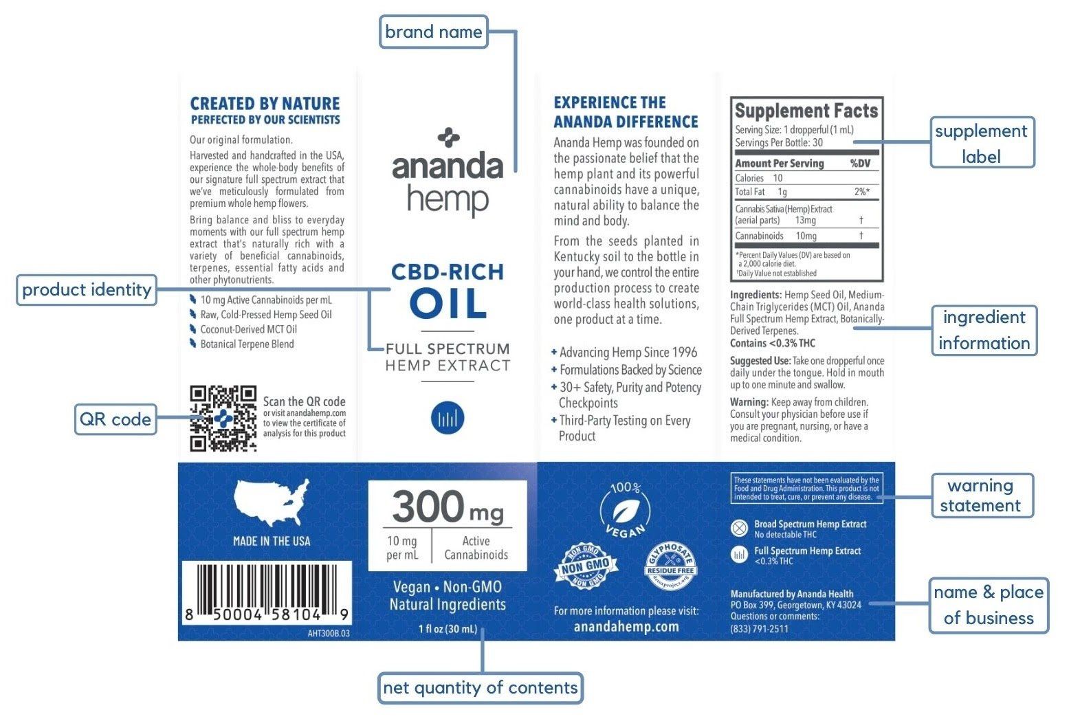
Very nearly all art created for print is done so digitally. Even art that is originally done by hand needs to be digitized in some way before going to print. There are vast benefits to digital design, but when your artwork is going from screen to print, there are some pitfalls to be aware of. Color renders differently on different mediums and ultimately may show variation from your screen to your printed piece. Many labels are on the smaller size to fit product containers, and if you’re working in your design program with a zoomed-in screen with high resolution, textual elements that seem perfectly legible to you may actually be too small for easy reading on the final product. When your artwork will ultimately be diecut, paying close attention to size, bleed lines, corner radius and the like are essential (if you want to brush up on these and other common printing terms, read this post on dielines and more).
Our team understands that label designers have a lot on their plates. That’s why our prepress department is here to review the little details like those mentioned above that can make a big difference. One of the first steps in our quality process is making sure your artwork files are set up correctly from the start. Members of our prepress team check every aspect of the proof we create, verifying that the technical information on the ticket, such as substrate material, copy position, die lines and corner radius, all match the proof. They are also experts on color, and will guide you to the appropriate print color process for your needs.
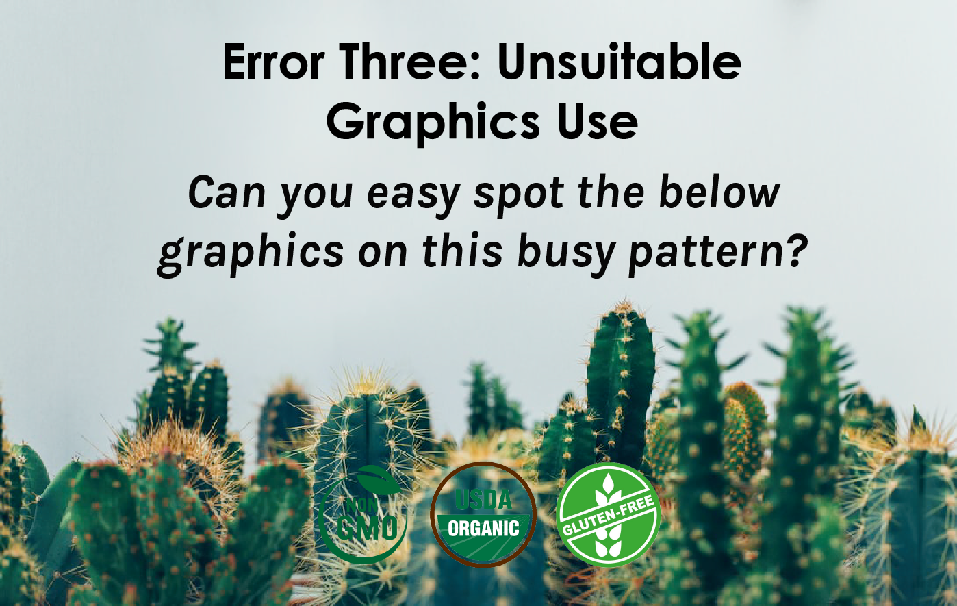
ERROR THREE: UNSUITABLE GRAPHIC USE
As mentioned above, there are some design features that may look fine on a screen but don’t translate well to print. If you have complex art that includes many different layers and/or elements, things could get disorganized or messy by the time you submit your artwork. Informative graphics, like the standard ‘Certified Organic’ and ‘Non-GMO’ logos or more custom icons are increasingly popular among brands from just about every industry; these are typically small features, and often several of them will be included on one label. If alignment, sizing, and color aren’t just right, the results will be extremely visible on the printed label.
As with all elements of your label design, our team is on the lookout for anything that will render unsuitable or questionable on your printed label. What’s more, we offer several different ways for you to review your label before it goes to print. All label orders will receive a PDF proof for you to review. You can also order a printed press proof that uses the exact ink and label material specified for your label project; we recommend this option for more complicated artwork. A proof is your last line of defense to confirm all aspects of your label are correct before going to print. Don't forget to check out our 3D rendering capabilities as well if you want to really bring your label art to life before the final print!
No one wants to see mistakes on labels, least of all us! We will work with you every step of the way from the time you request your quote until you receive the final printed labels to help mitigate potential mistakes. You can read all about our quality process in our three-part blog series ‘Perfection through Process’ if you want to learn more about the specific steps we take to ensure the labels that leave are building are phenomenal!
RECENT POSTS